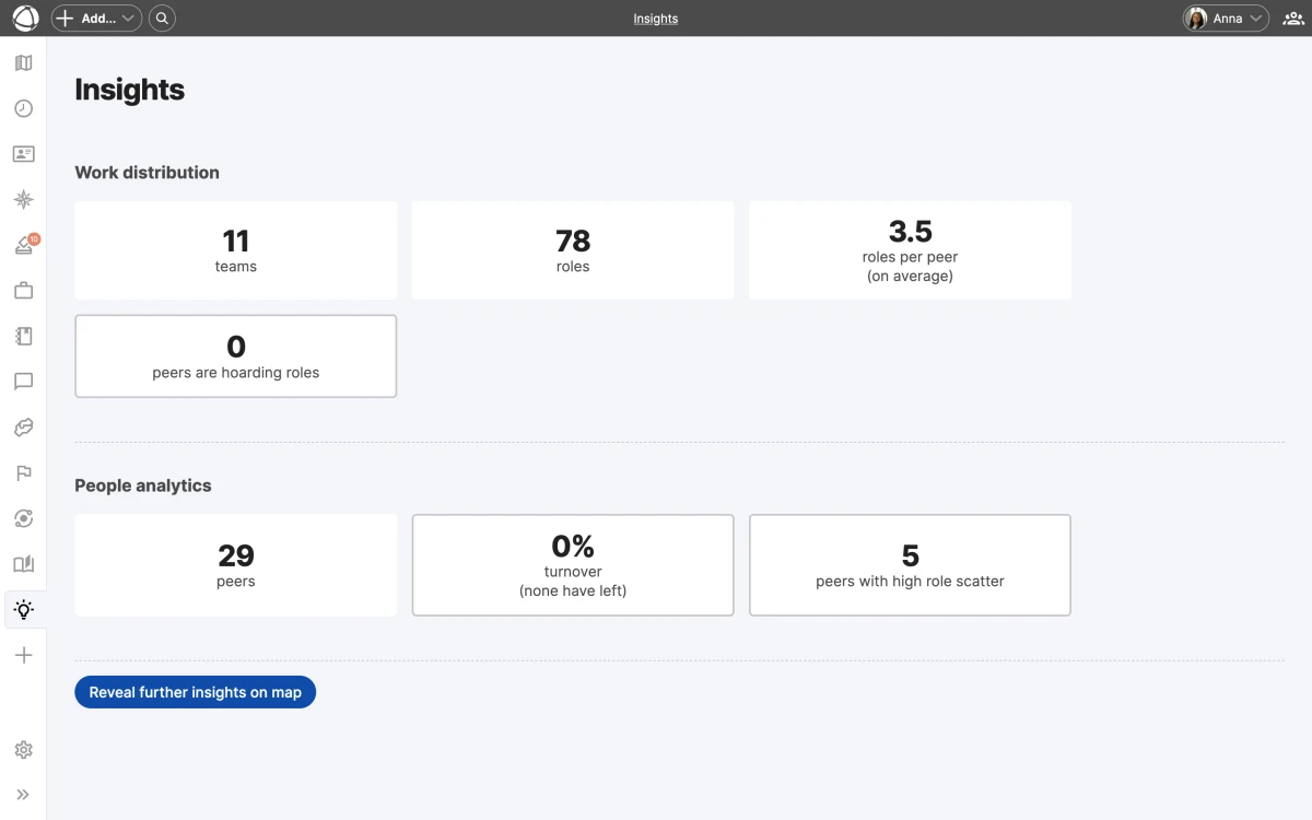
Insights
Insights overlays color-coded analytical data directly onto your map, revealing patterns that are hard to spot manually. Each insight highlights a specific organizational dynamic and helps you take action before problems grow.

Available insights
Insights offers three analytical views, each focused on a different pattern:
- Role Turnover shows how frequently roles change holders over the last 3 months. The color scale runs from blue (stable) to red (high turnover).
- Cell Scatter shows how spread out a peer’s workload is across the organization. The scale runs from light cyan (focused) to dark green (scattered).
- Role Hoarding shows where decision-making power is concentrated. The scale runs from light yellow (balanced) to dark brown (concentrated).
Select an insight from the Insights panel in the App Store sidebar. The map recolors immediately to reflect the selected analysis.
Dashboard and metric cards
Each insight includes a dashboard with aggregate statistics at the top of the panel. Click any metric card to filter the map view and zoom into the relevant area. The dashboard gives you a high-level summary, and the map gives you the details.
Inspector panel
When an insight is active, the Inspector panel shows a ranked list of the most affected nodes. This list helps you identify which roles, circles, or peers need attention first, sorted from most to least affected.
Share a specific view
When you activate an insight, the URL in your browser updates to reflect your current selection. Copy and share this URL to send a colleague directly to the same view.
Related
- Journal: track individual changes over time
- Contribution: see how work is distributed
- Map Layers: toggle overlays on your map
- Navigating the Map: explore views and search


