Explore live organization maps
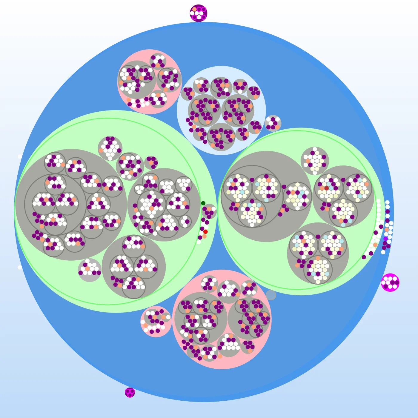
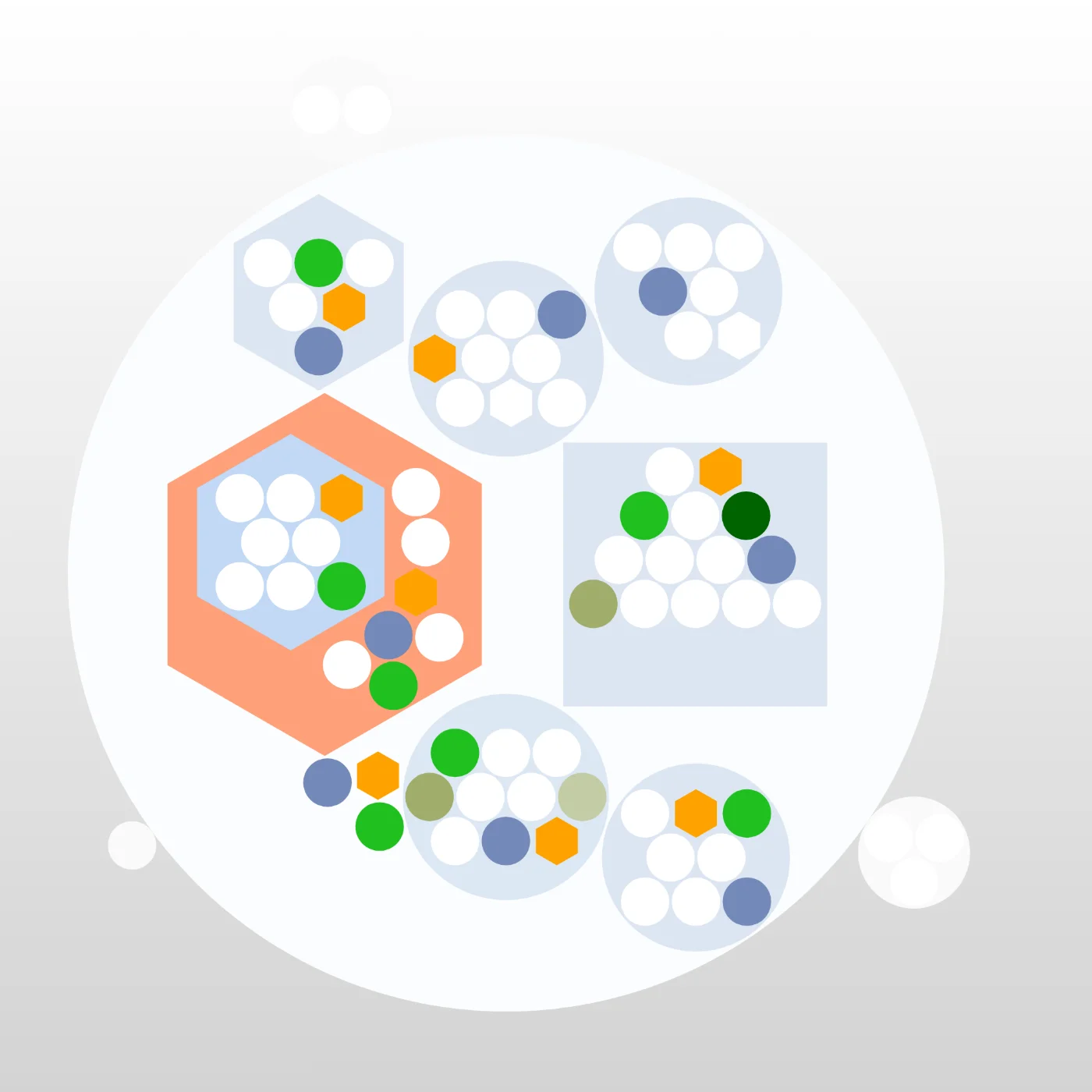
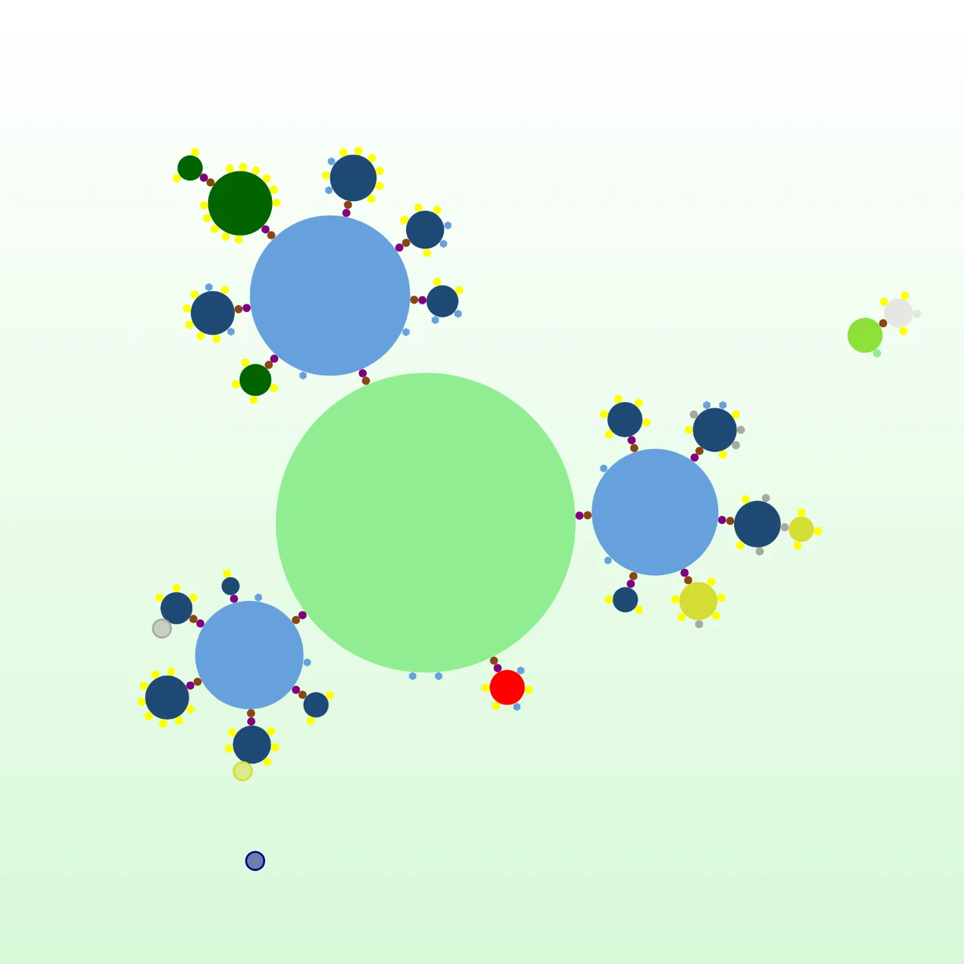
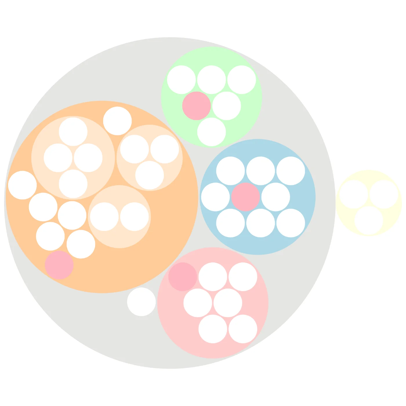
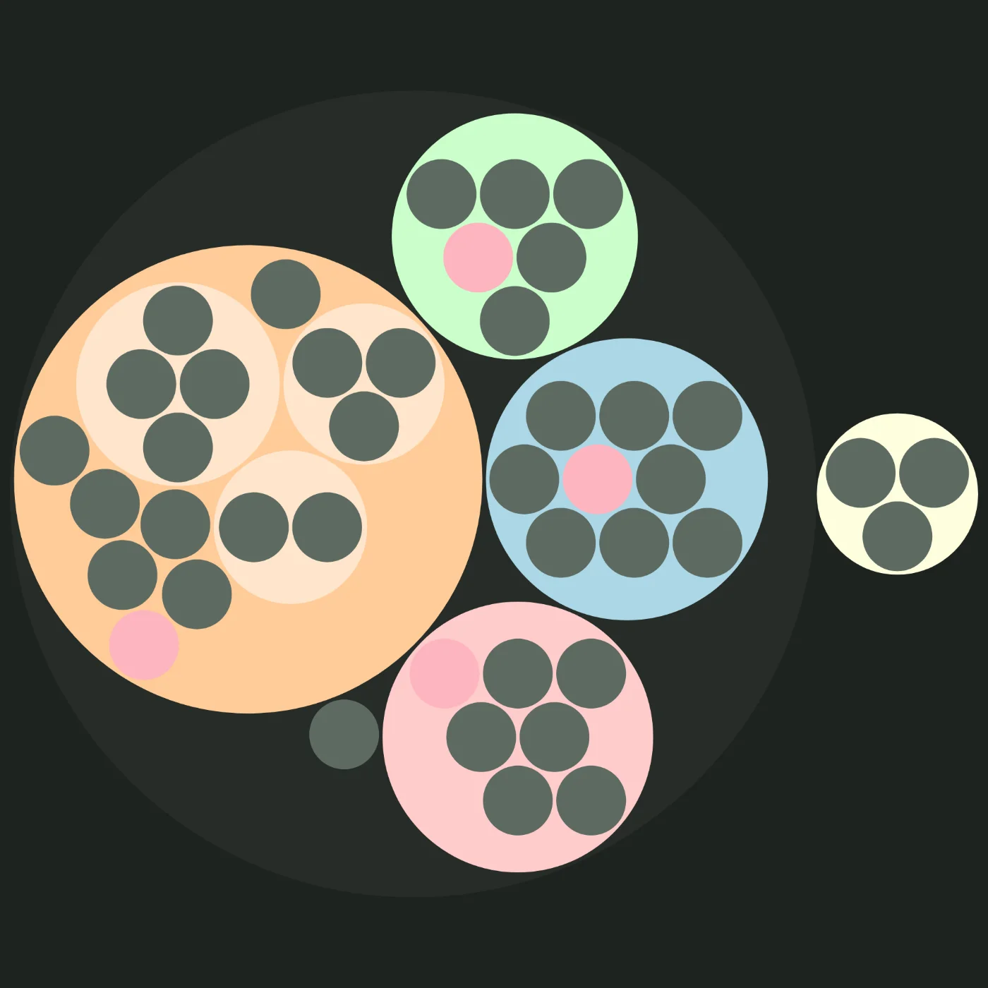
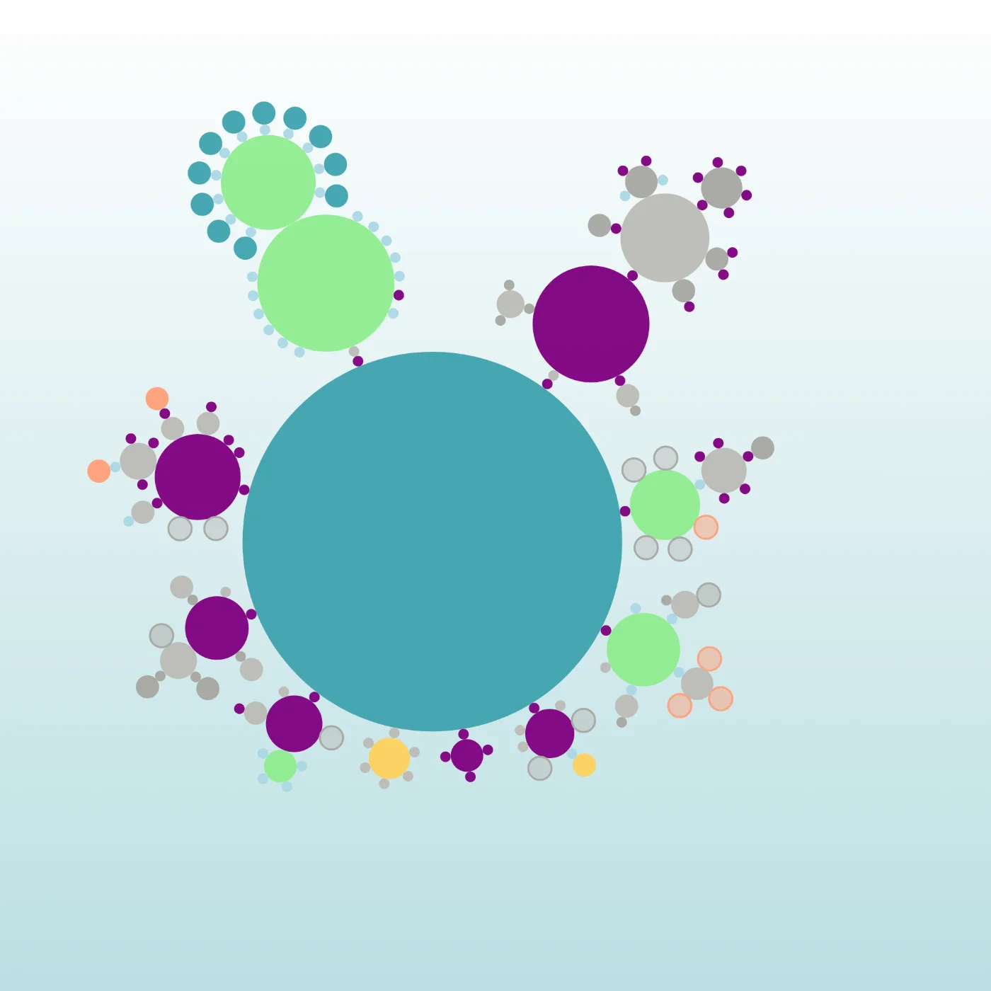
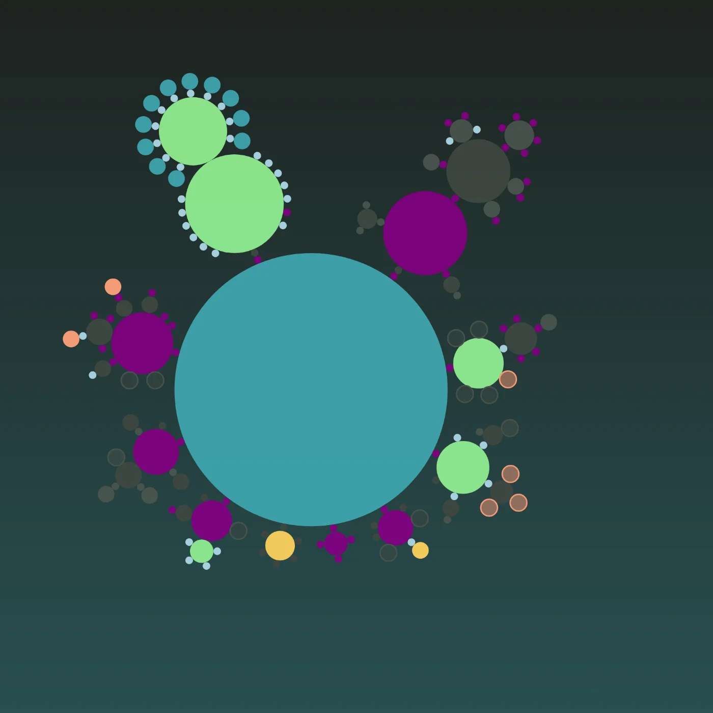
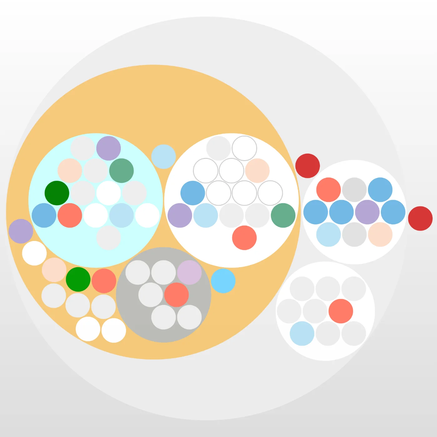
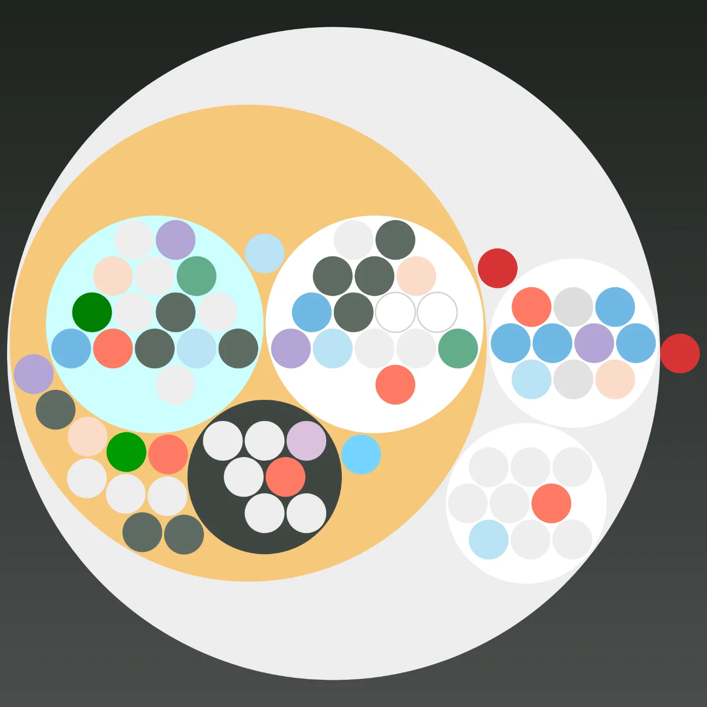
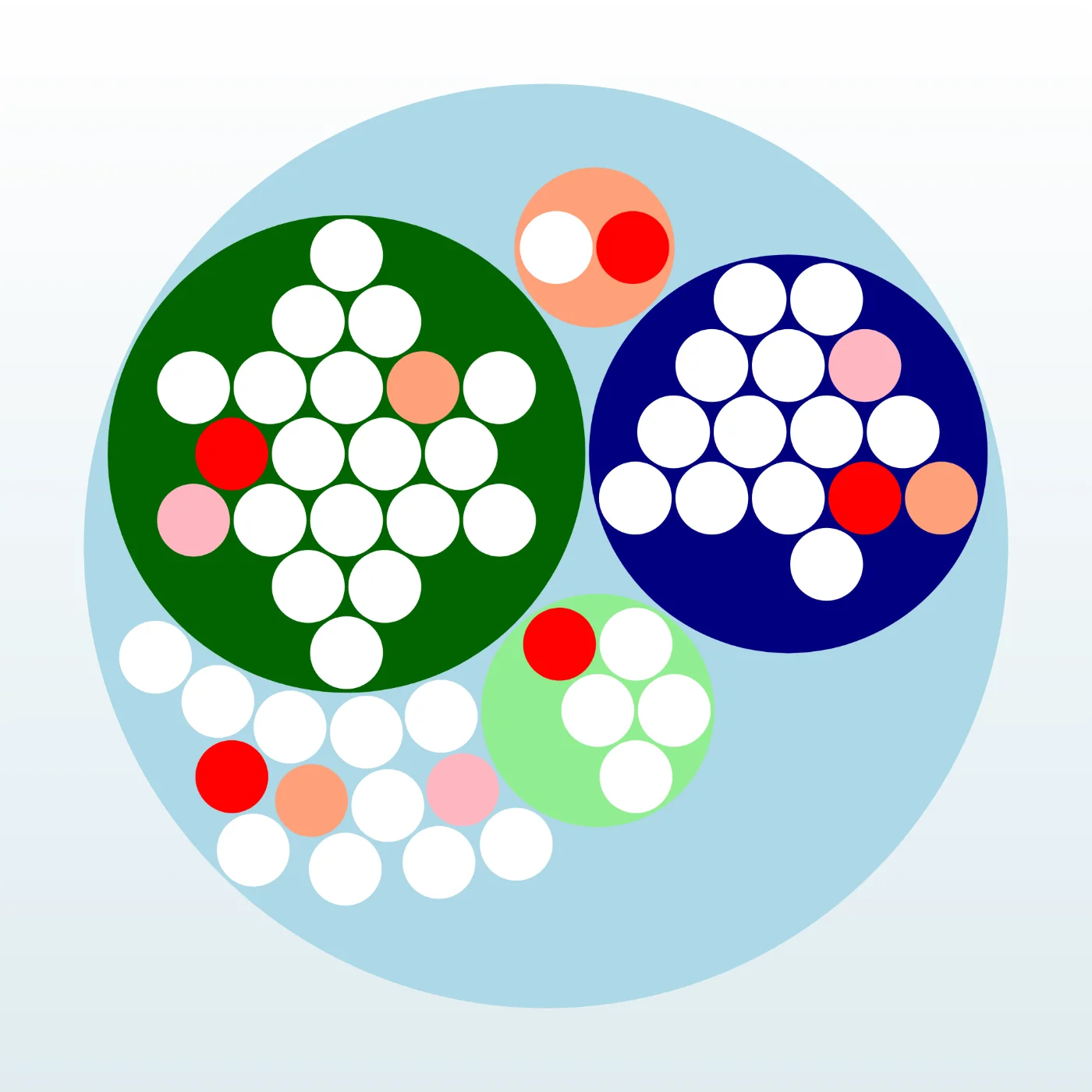
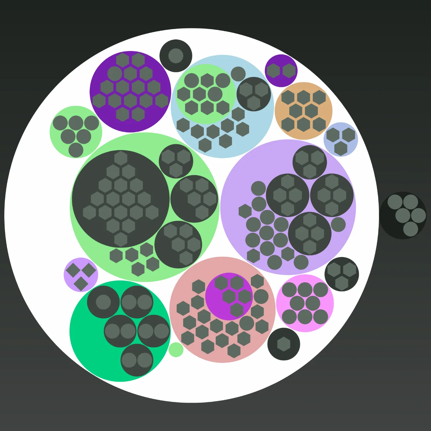
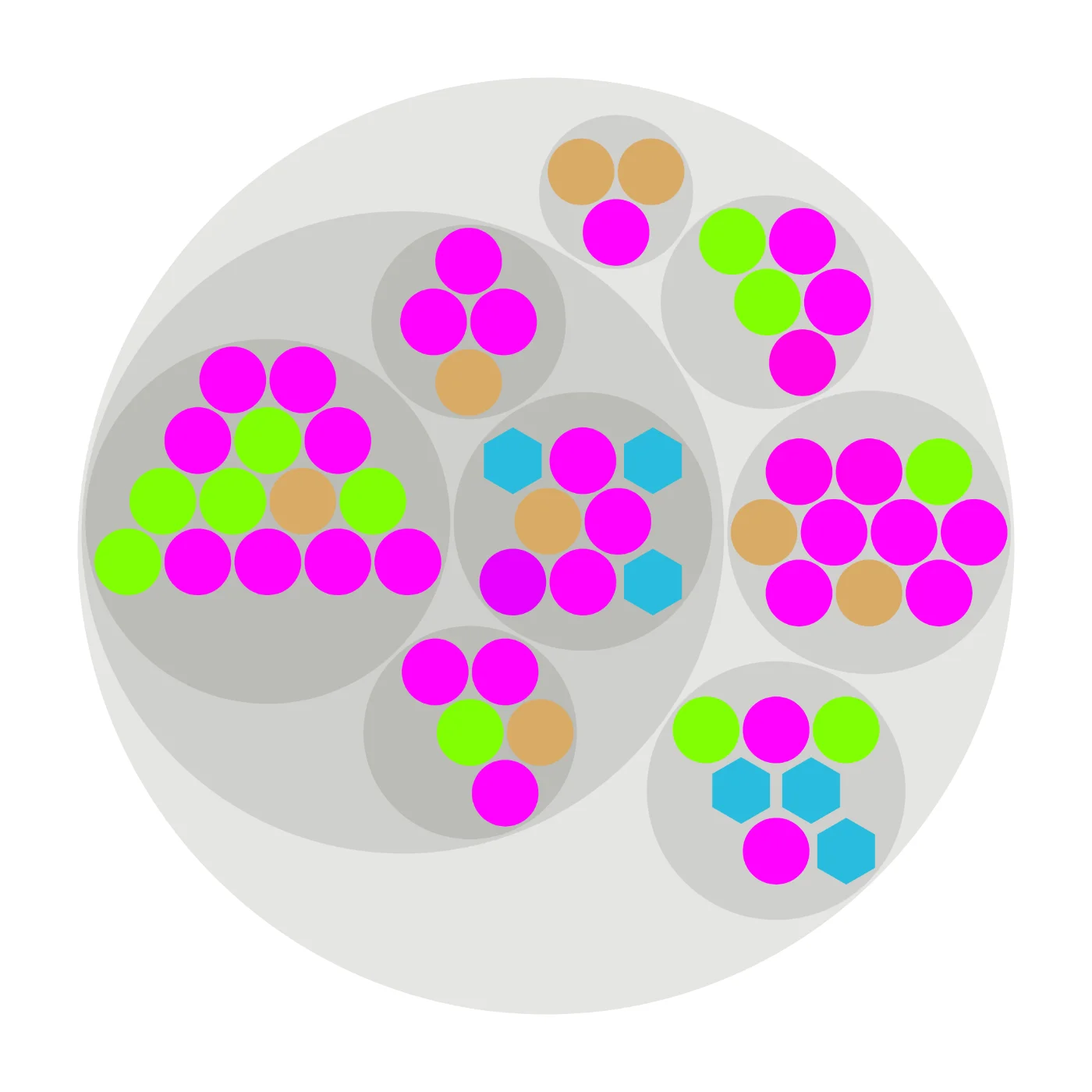
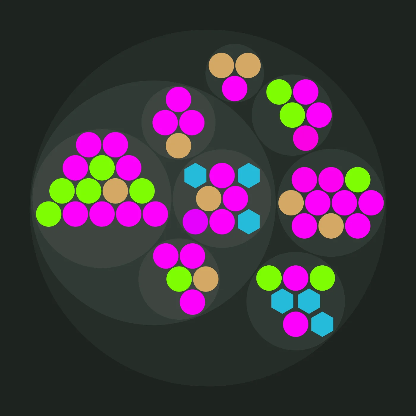
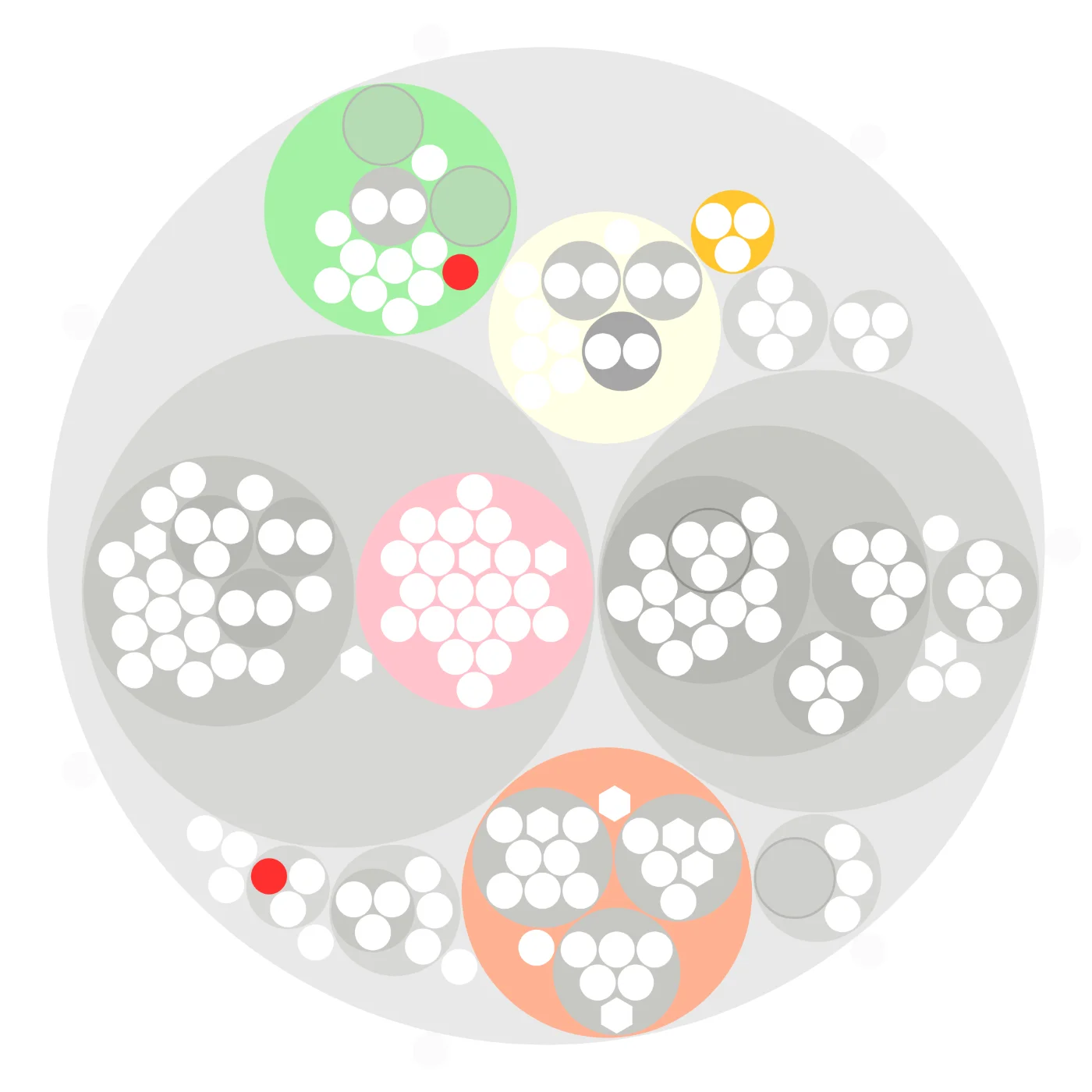
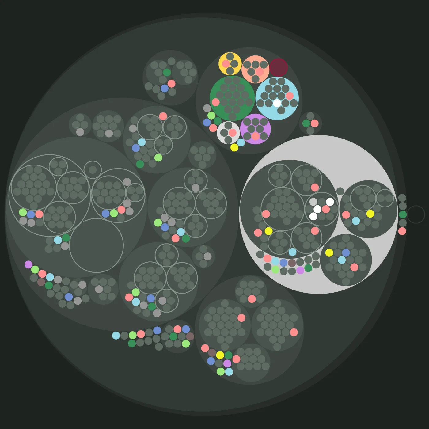
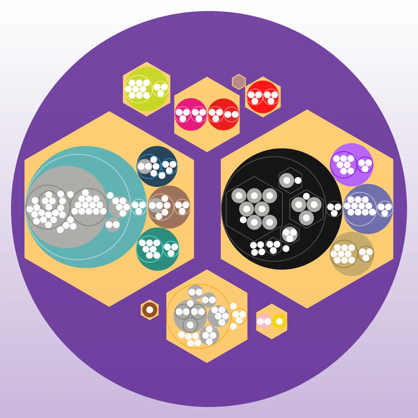
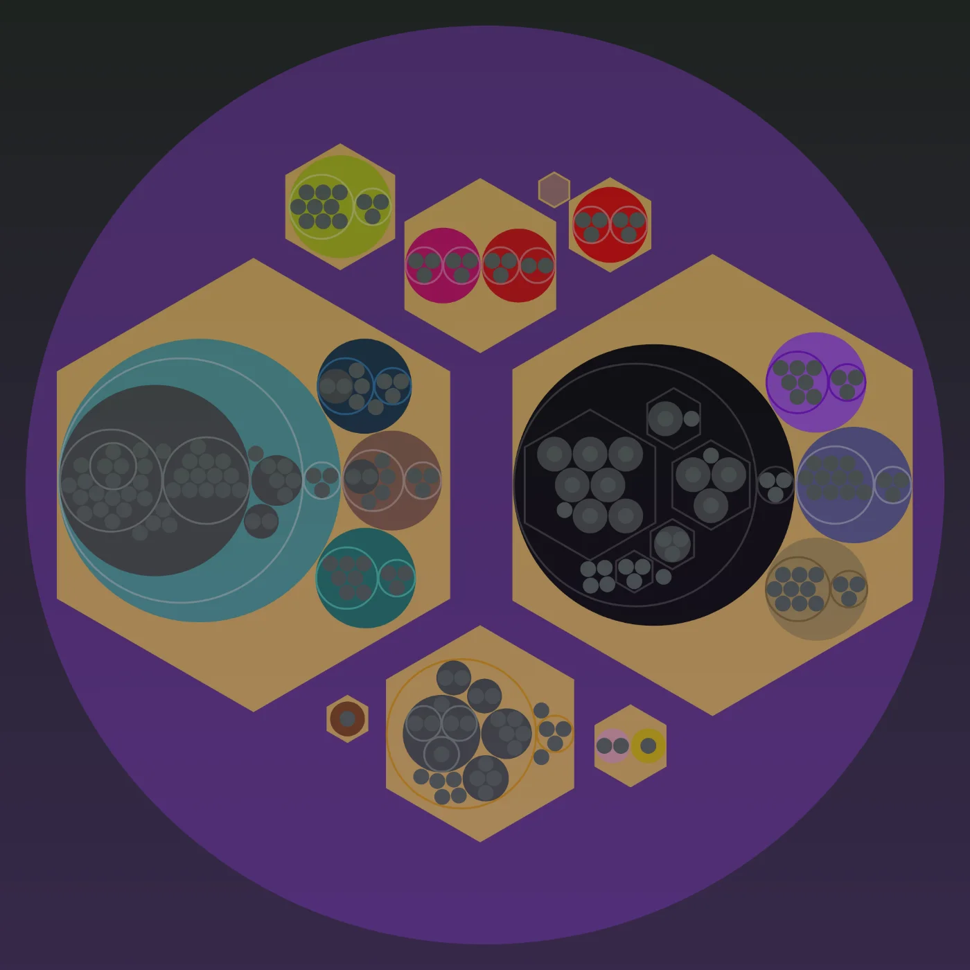
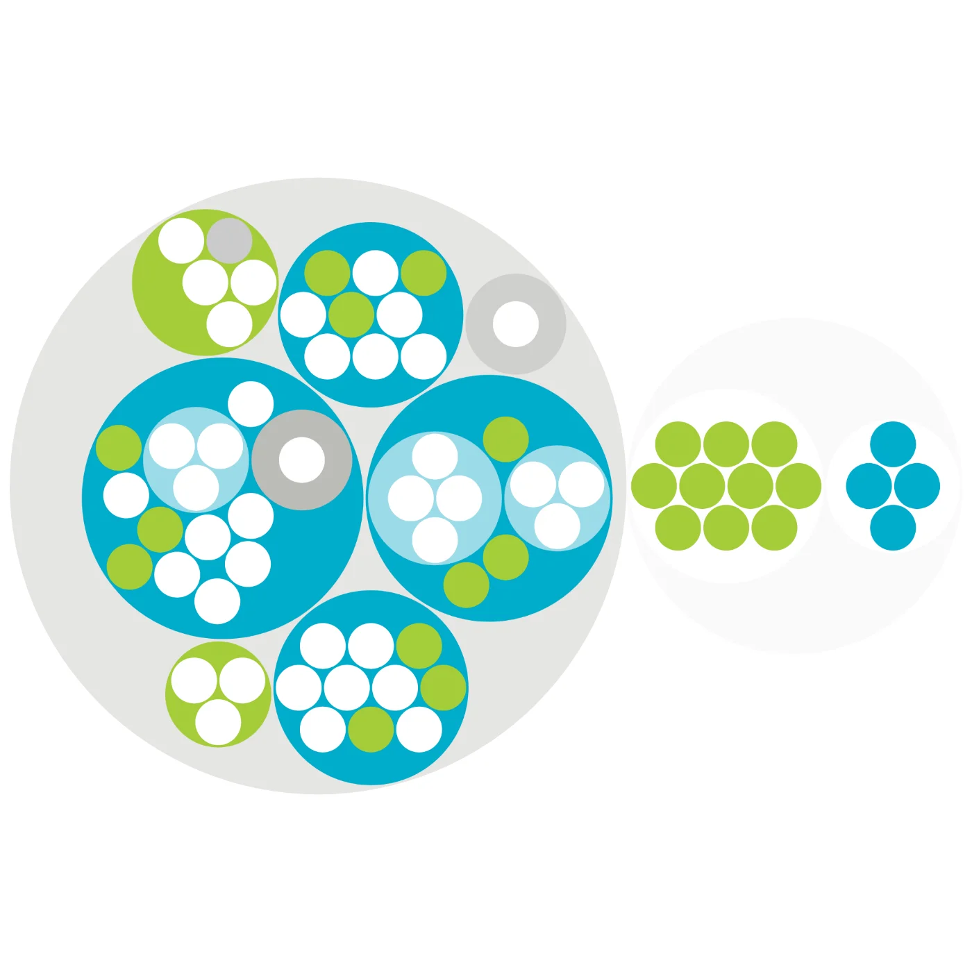
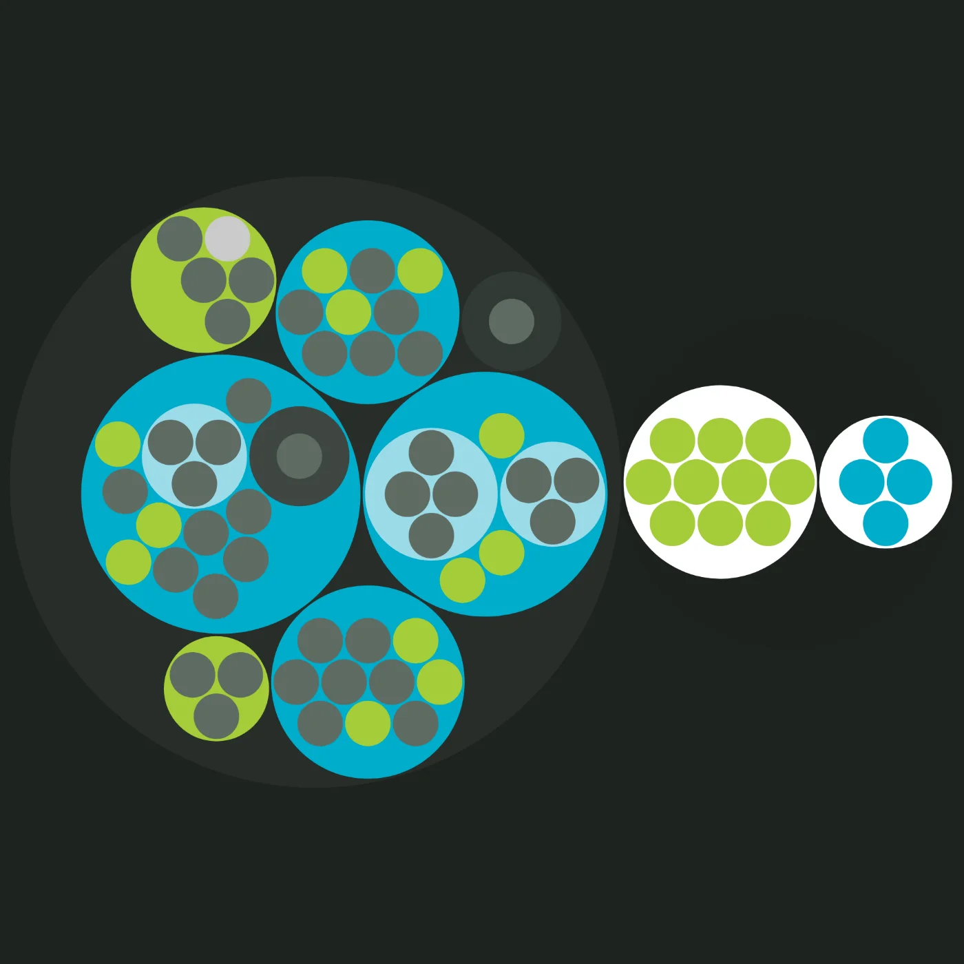
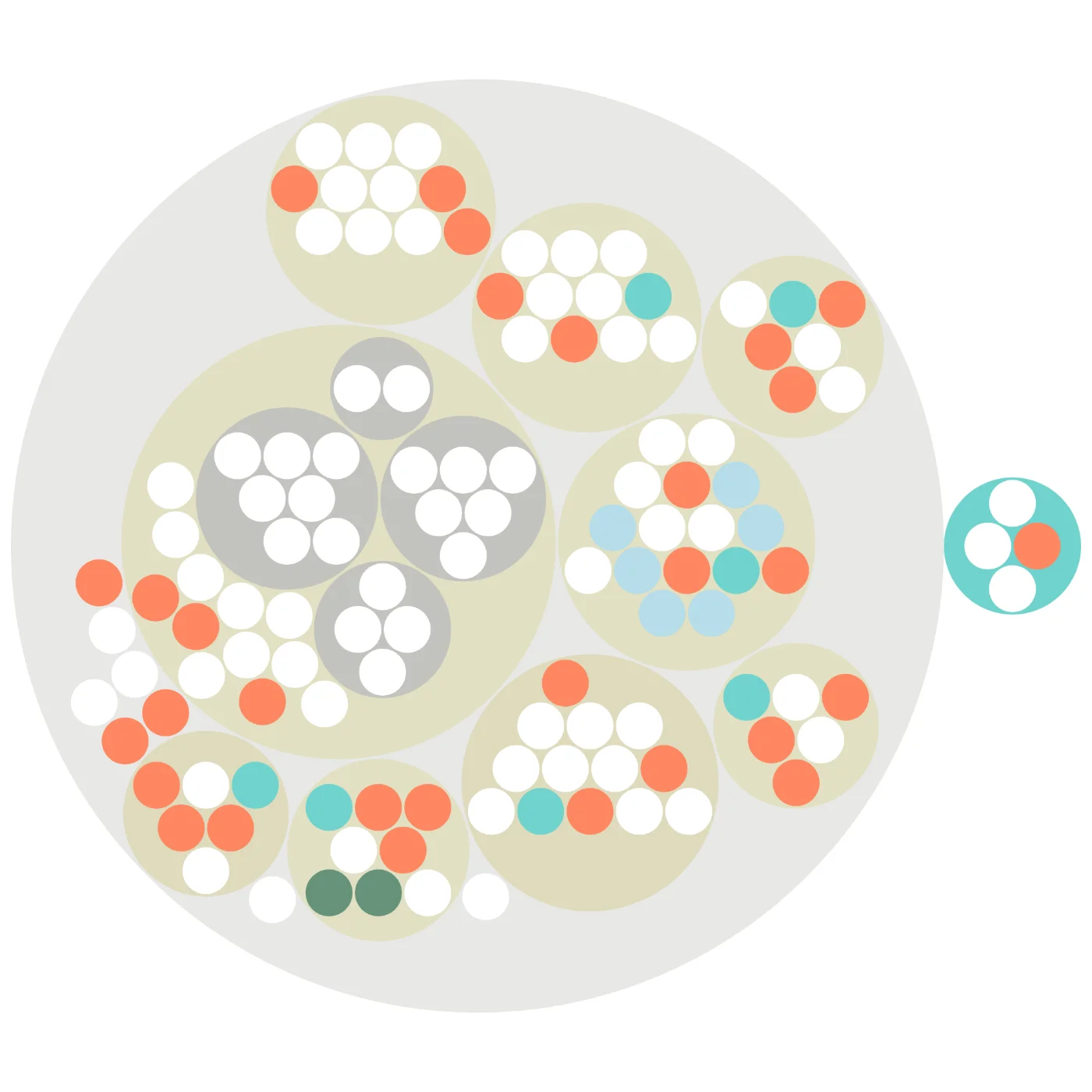
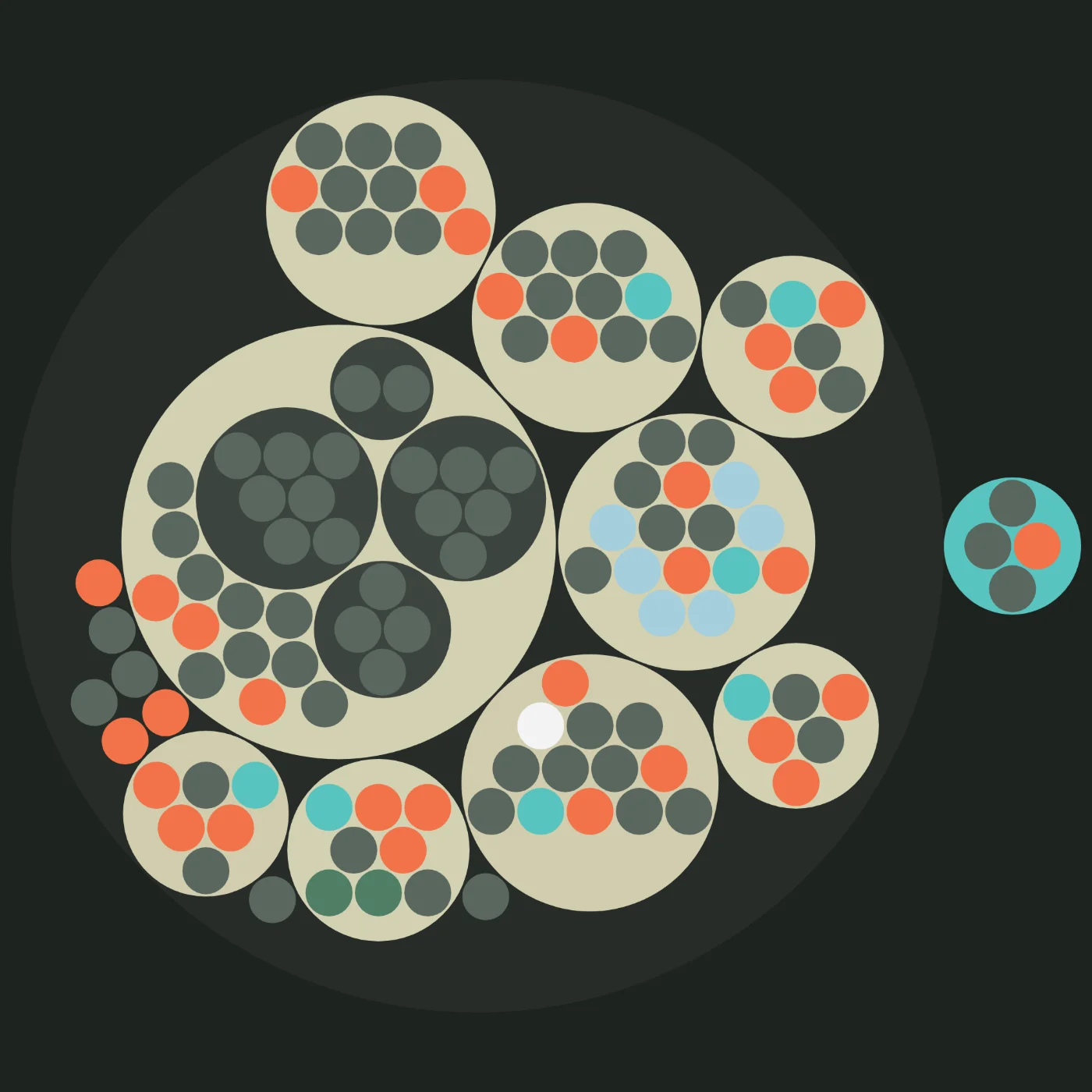
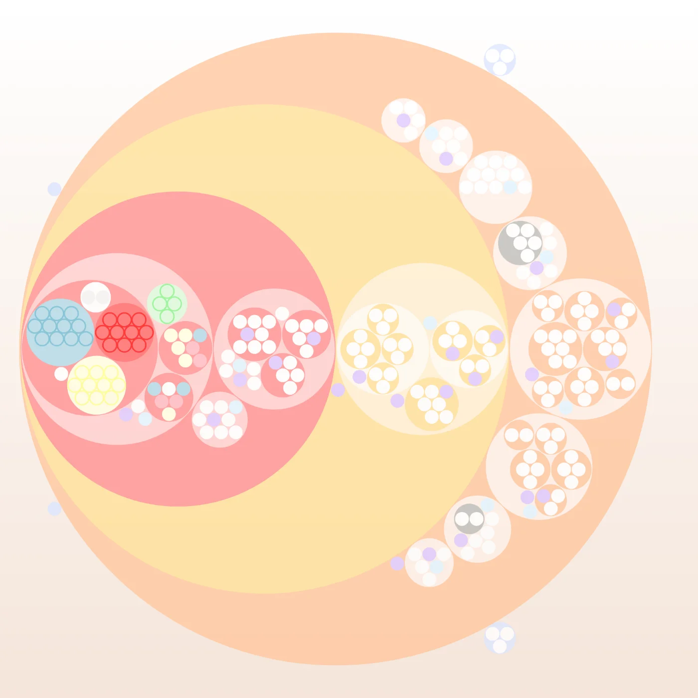
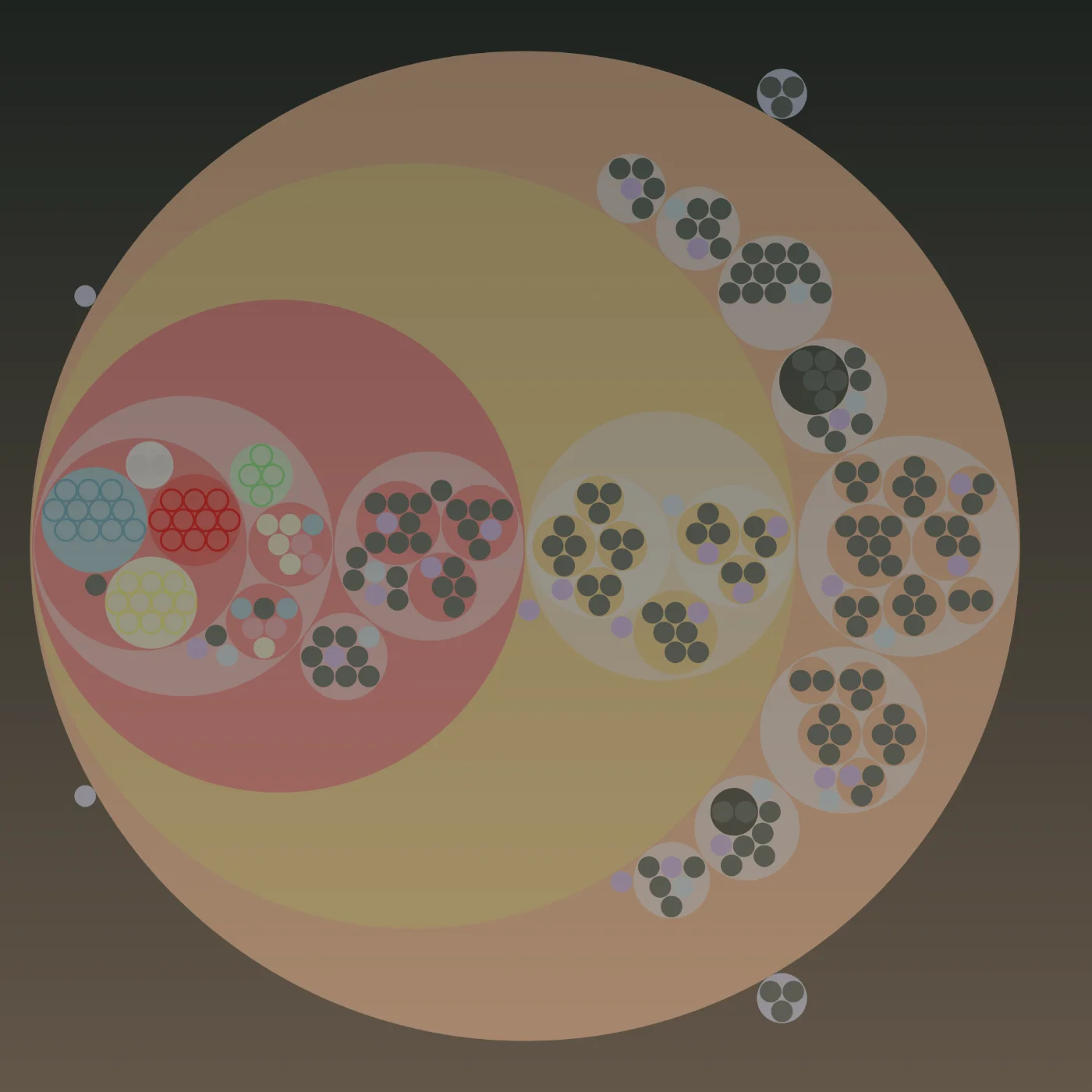
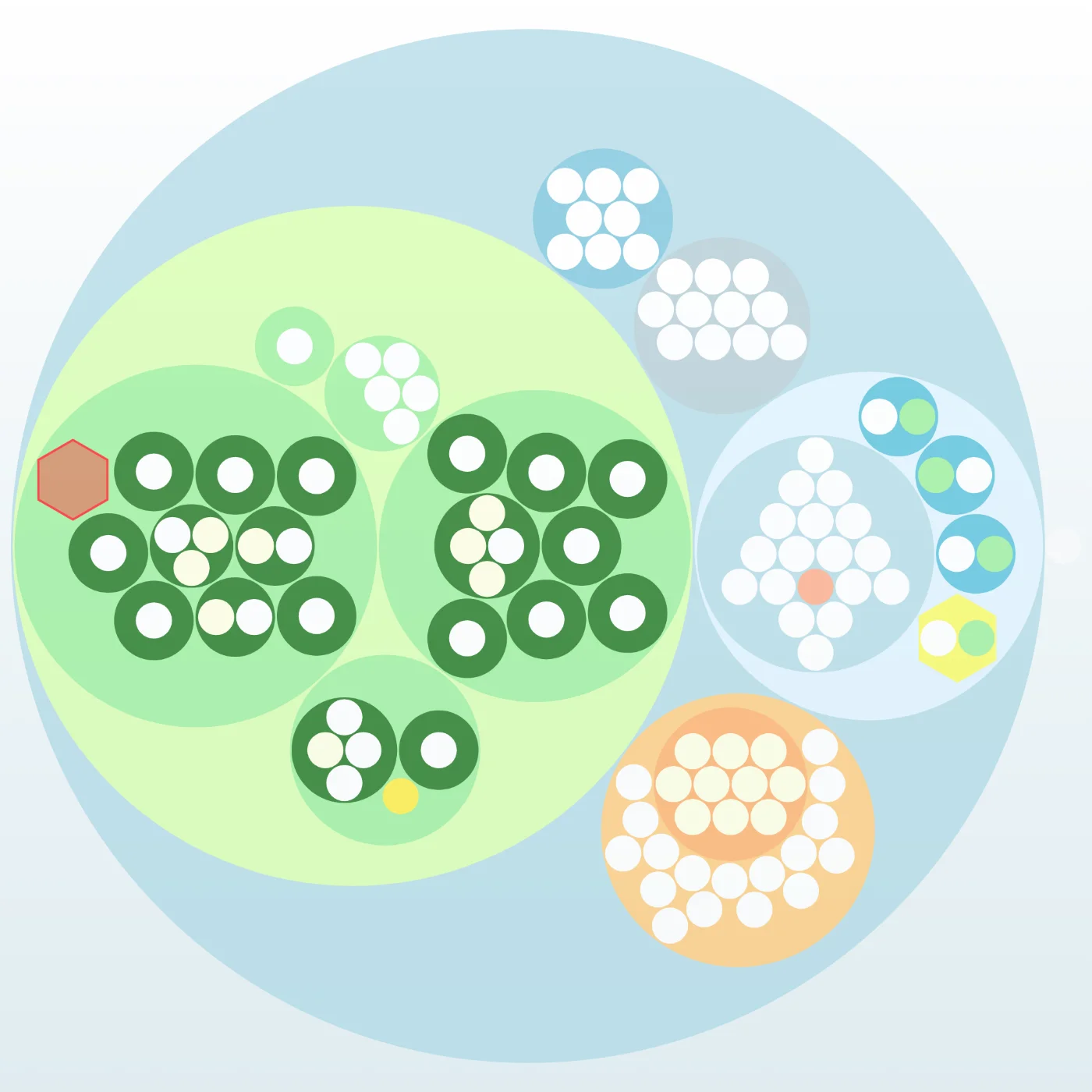
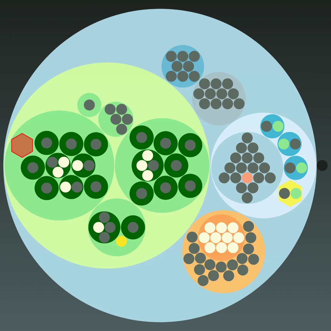
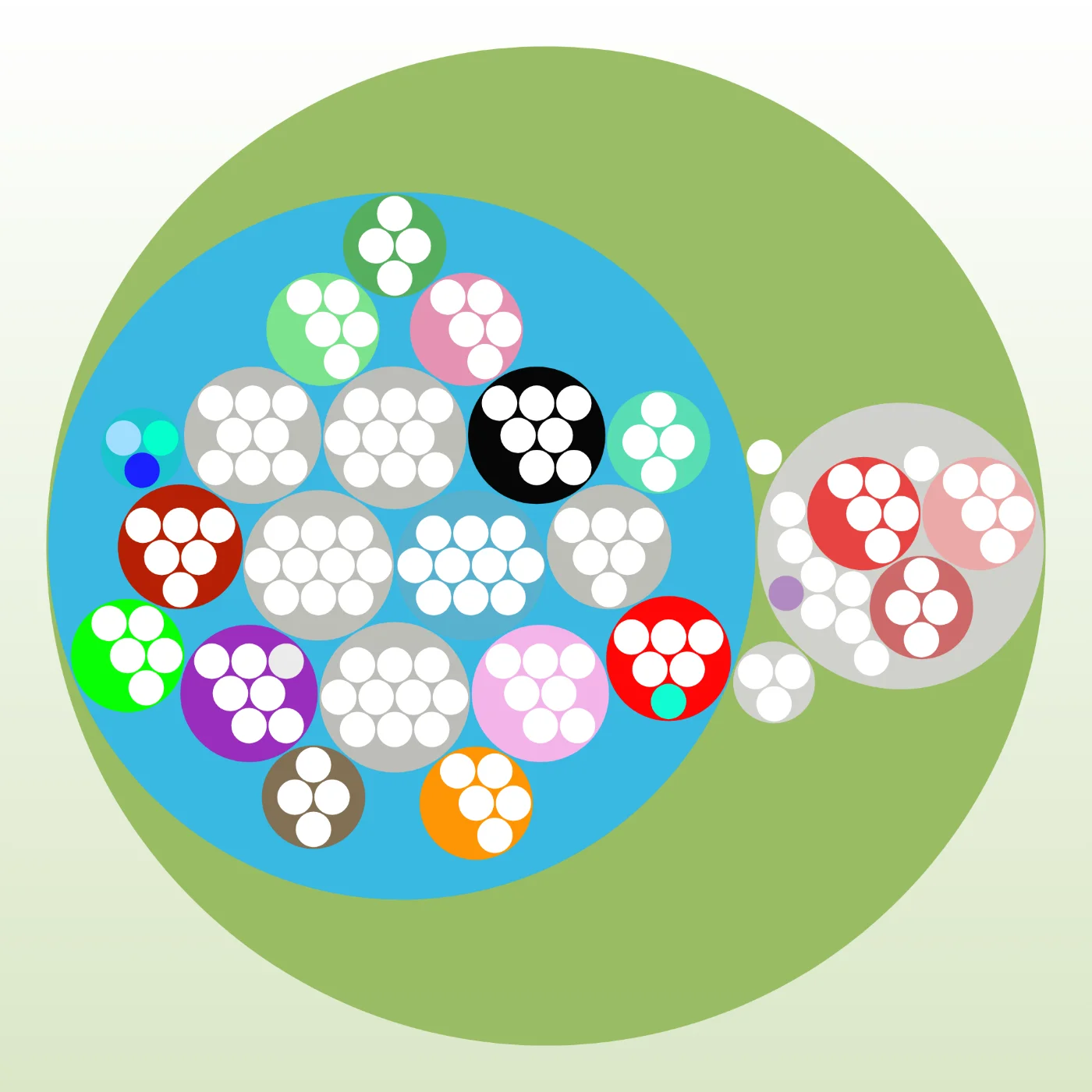
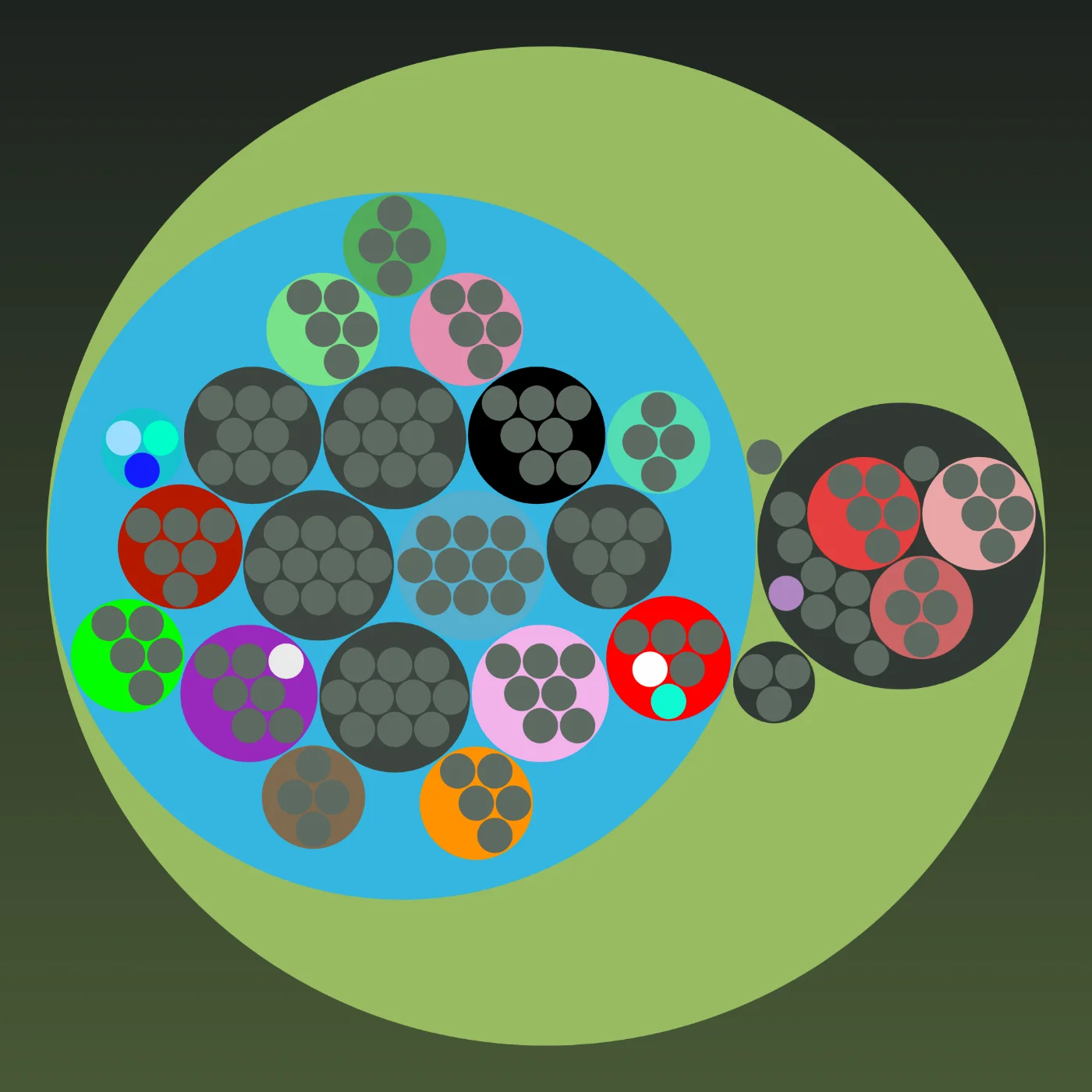
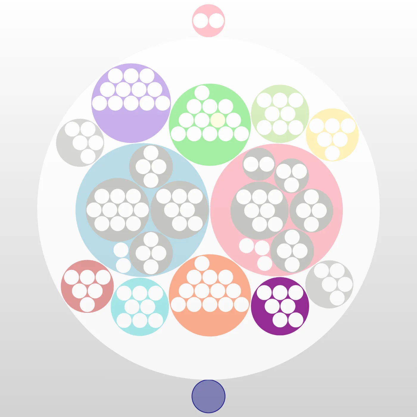
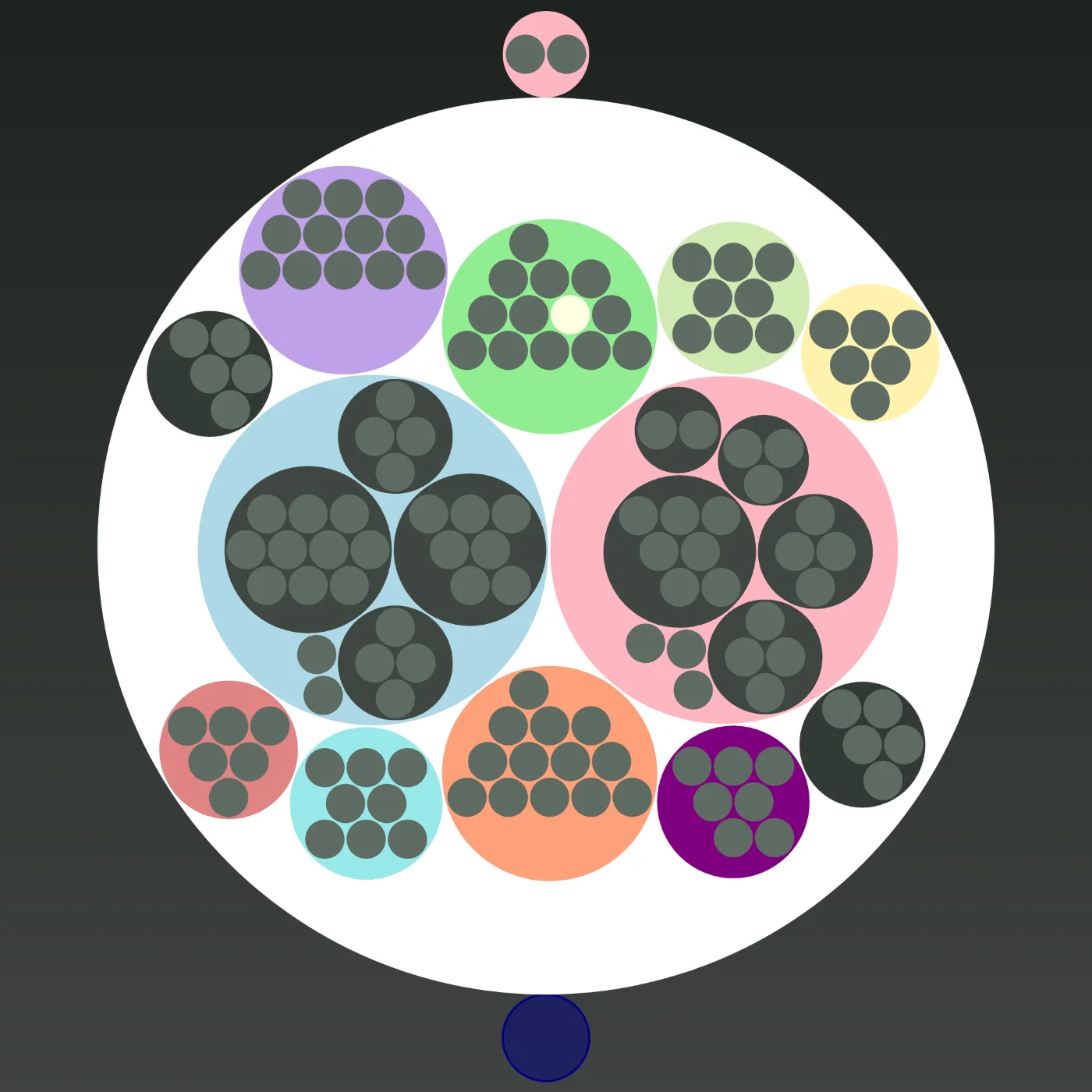
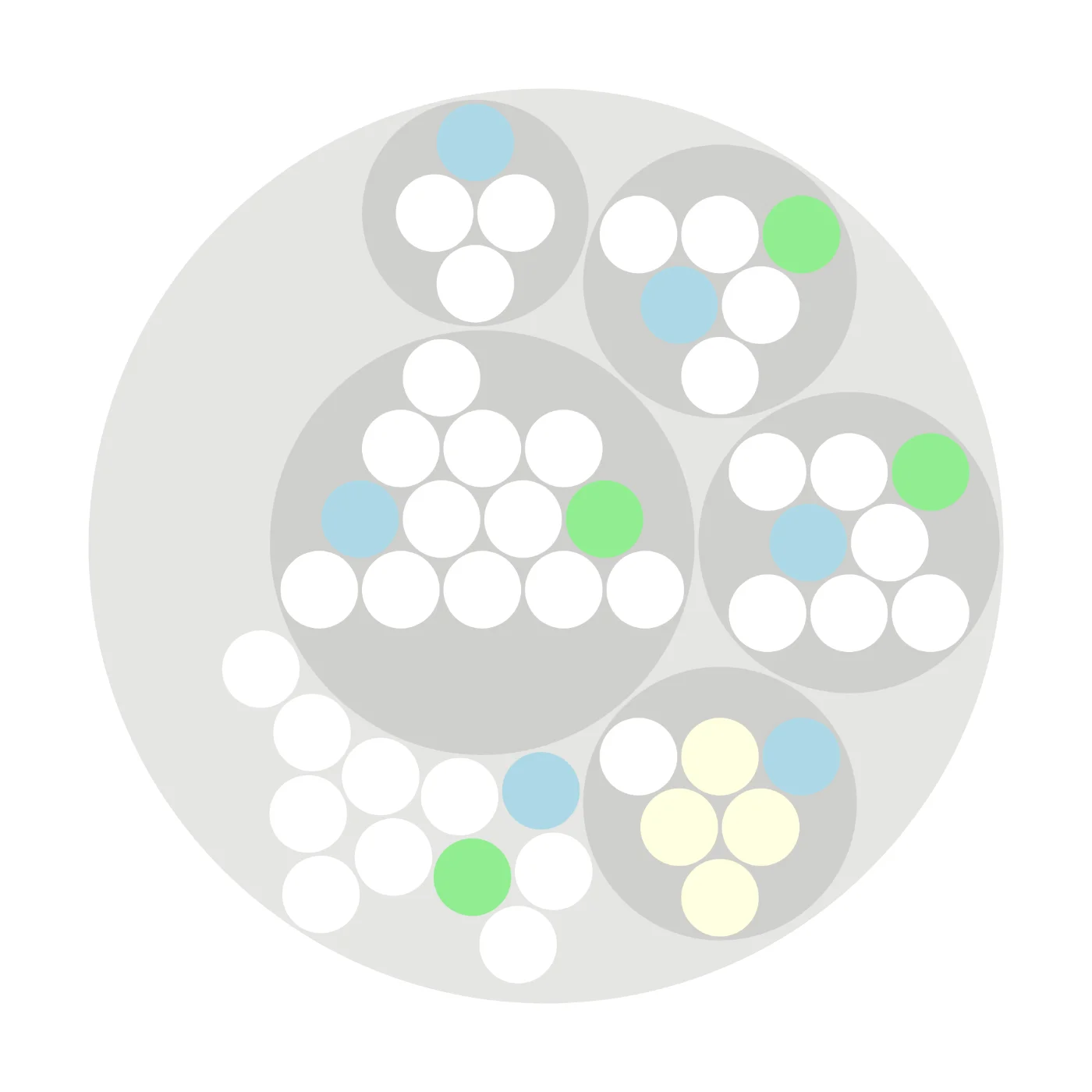
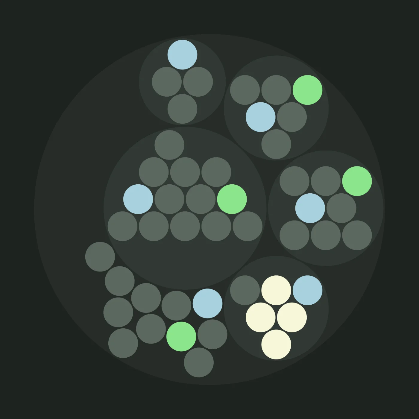
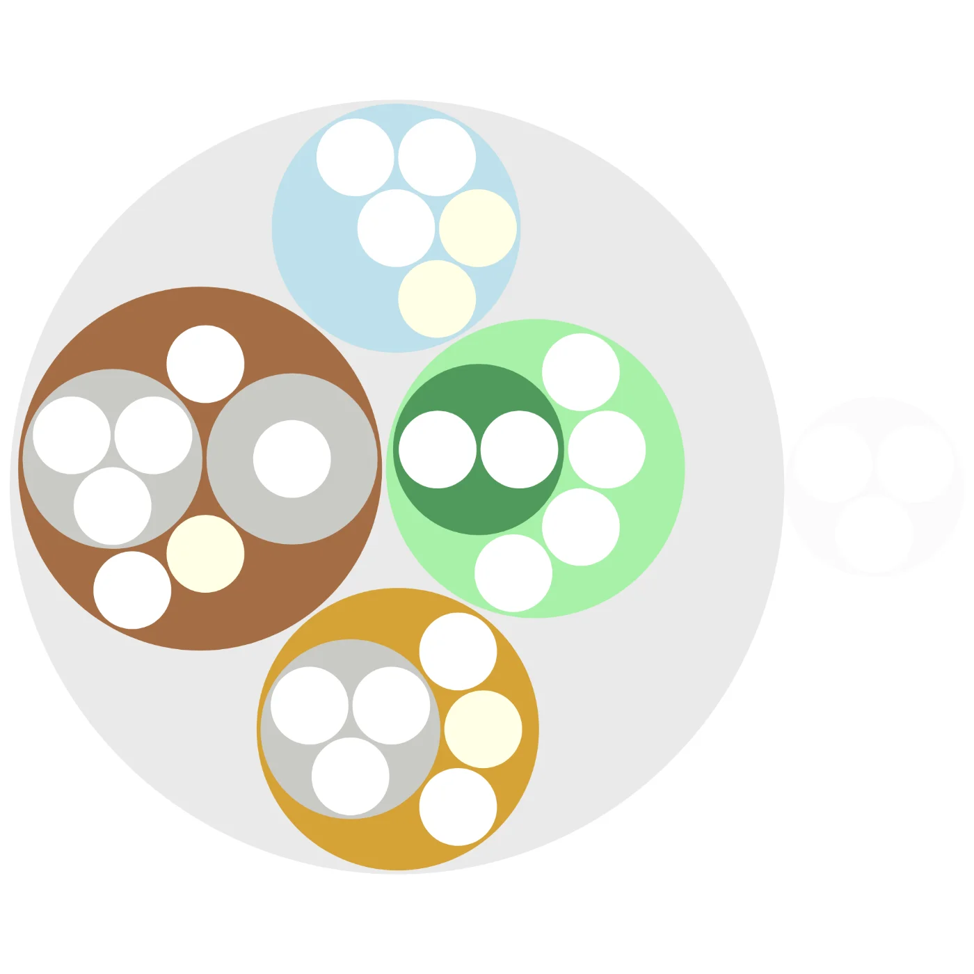
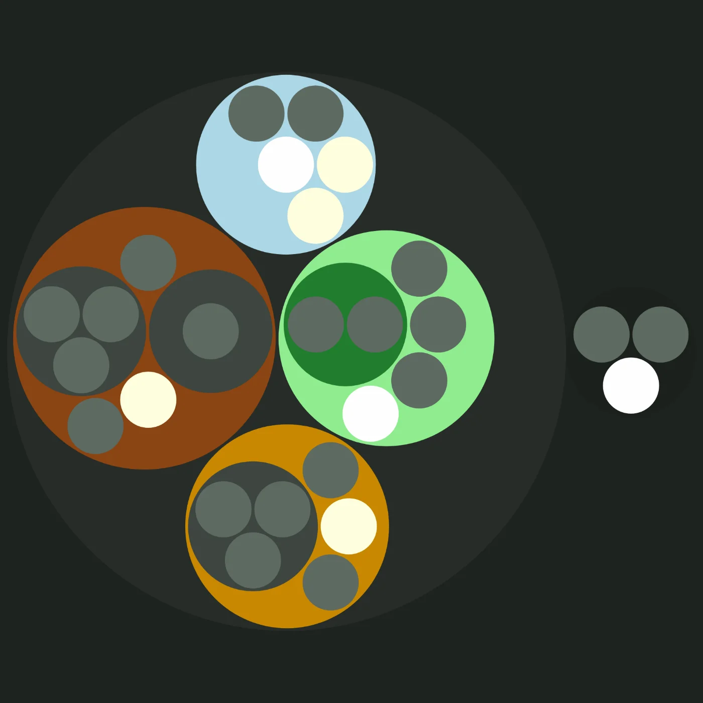
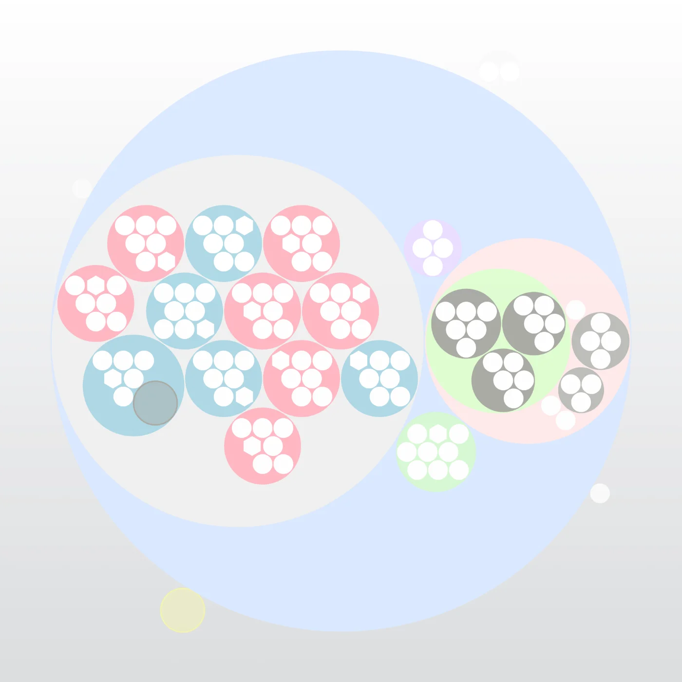
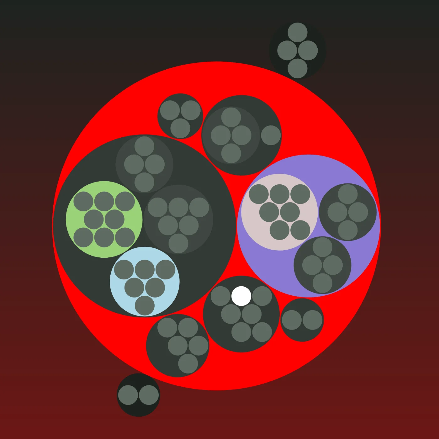
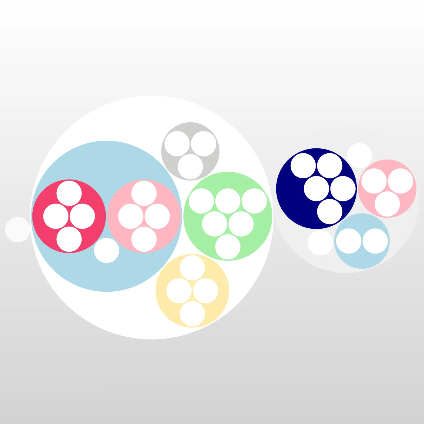
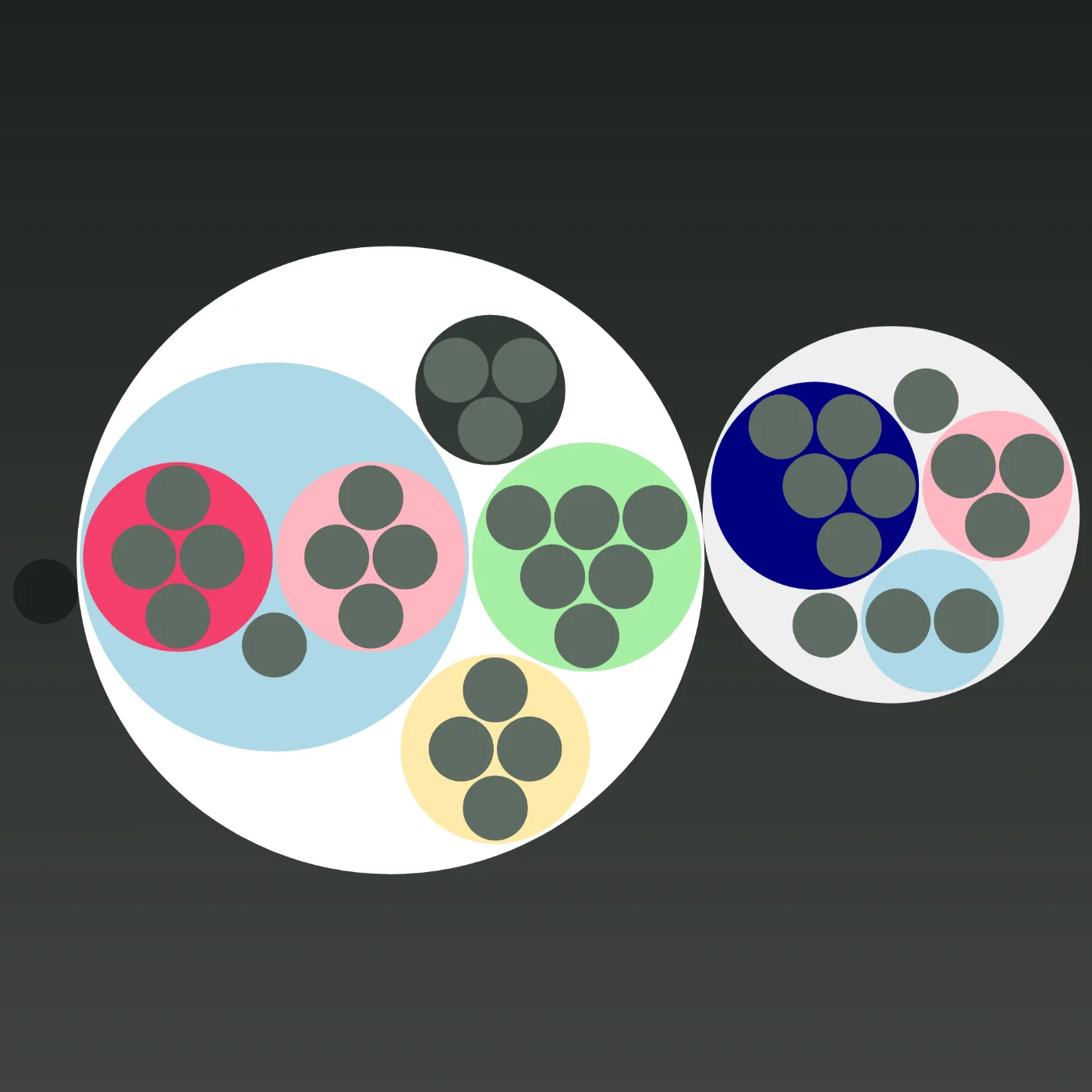
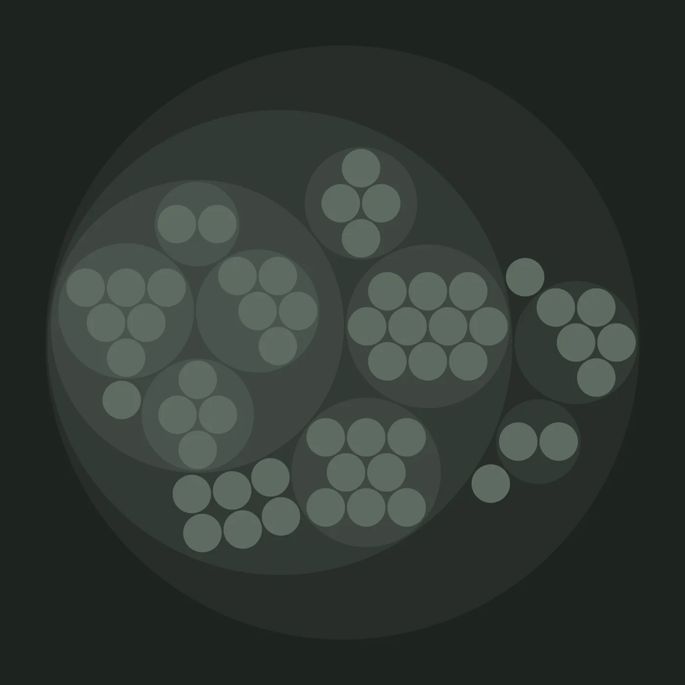
These are real organizations that use Peerdom to map their structure openly. Navigate their teams, roles, and responsibilities to see how modern, agile organizations actually work.
- 52
- organizations
- 1'221
- teams
- 3'215
- people
- 6'447
- roles






Common questions about live org charts
What visitors ask most about these public maps
Can I browse real org charts from other organizations?
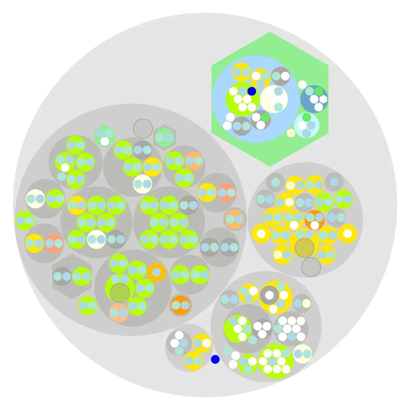
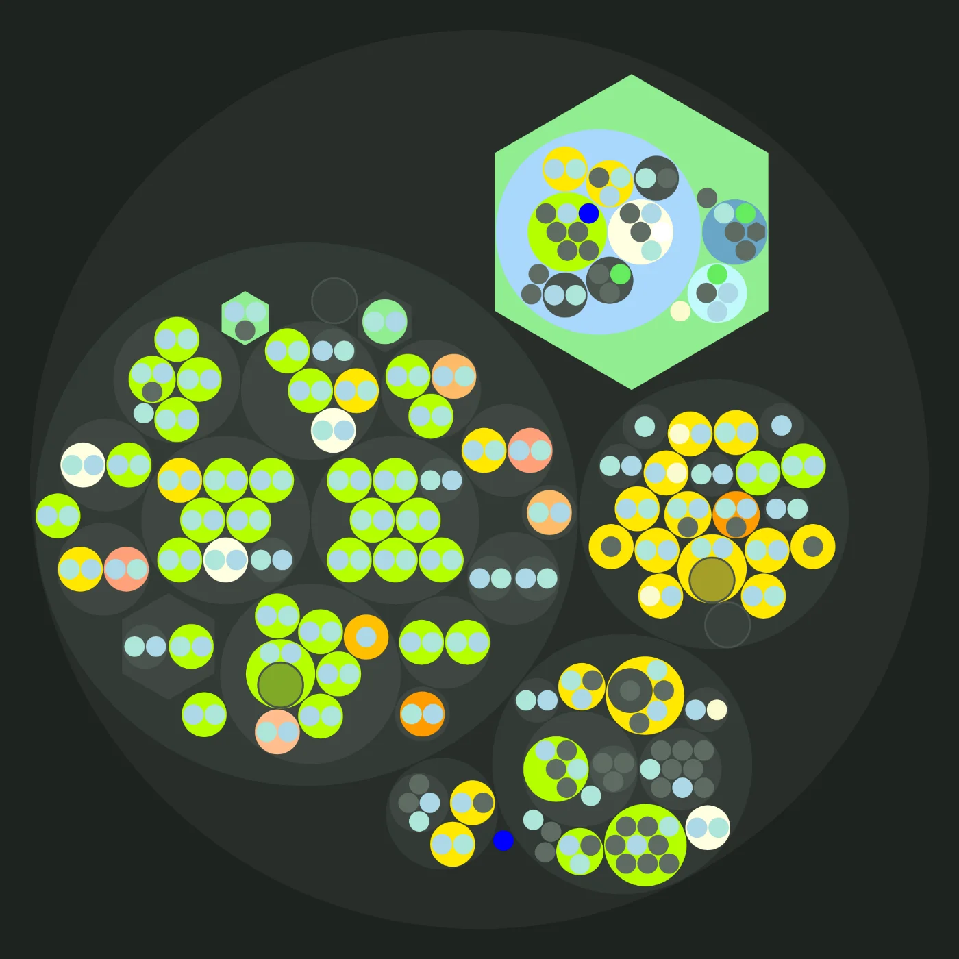
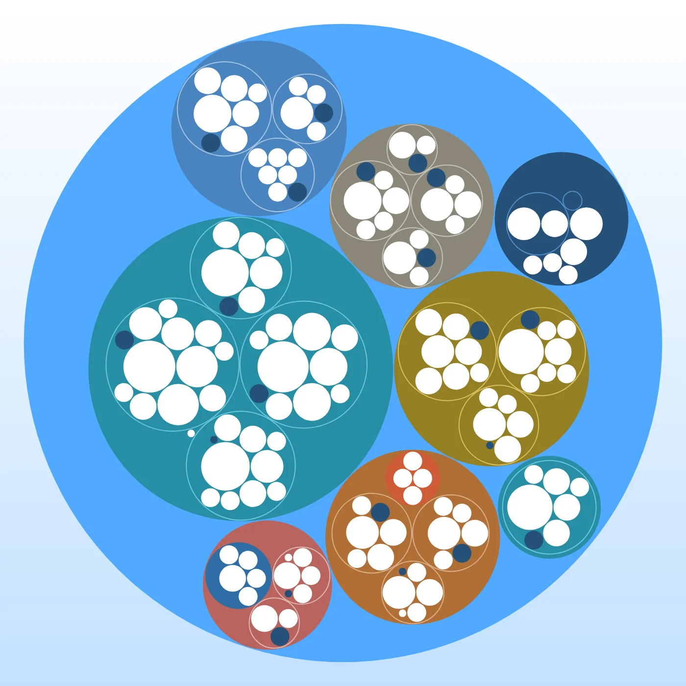
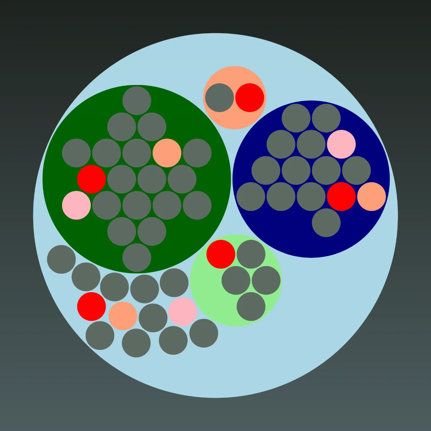
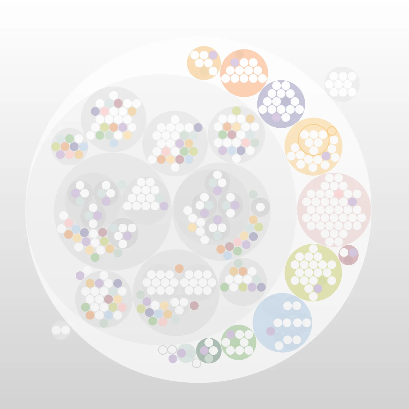
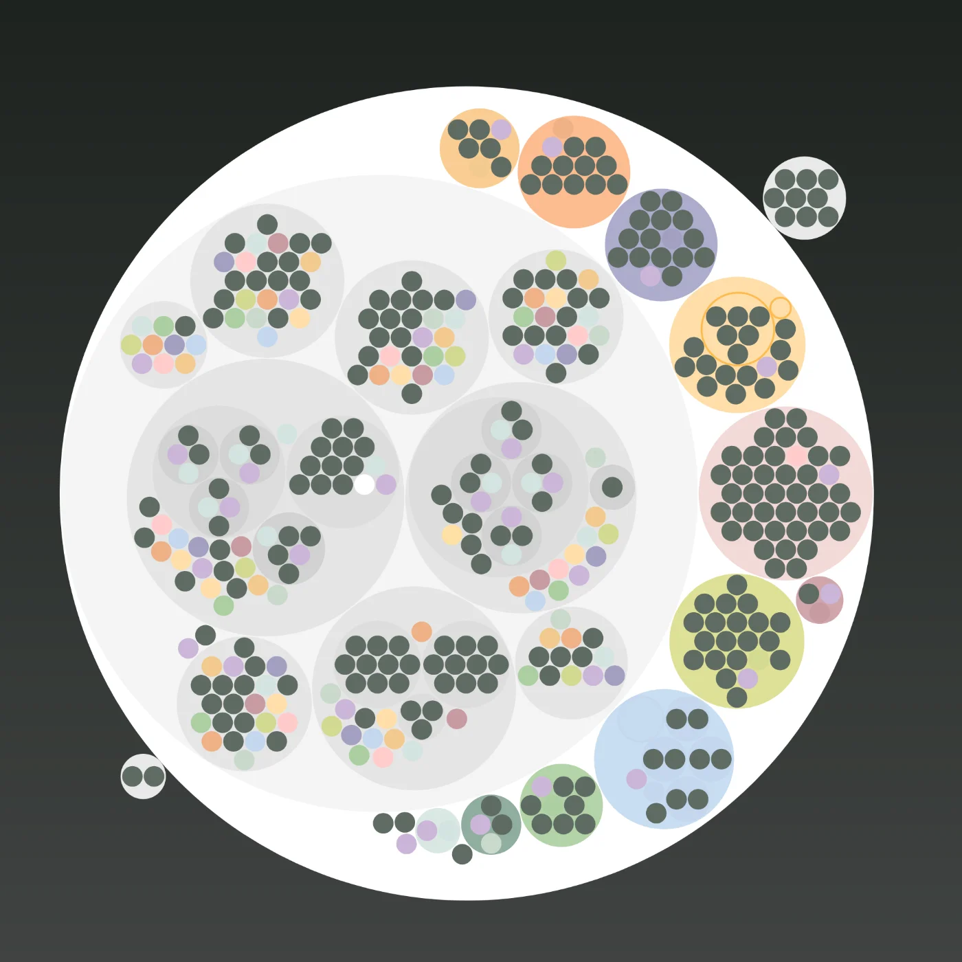
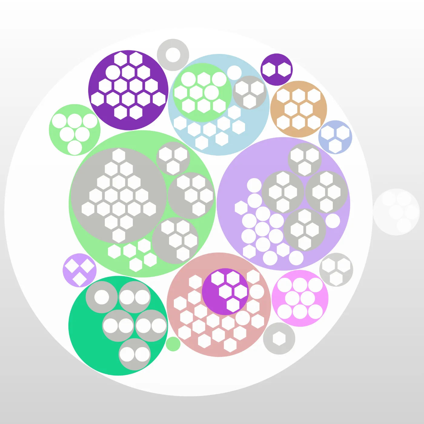
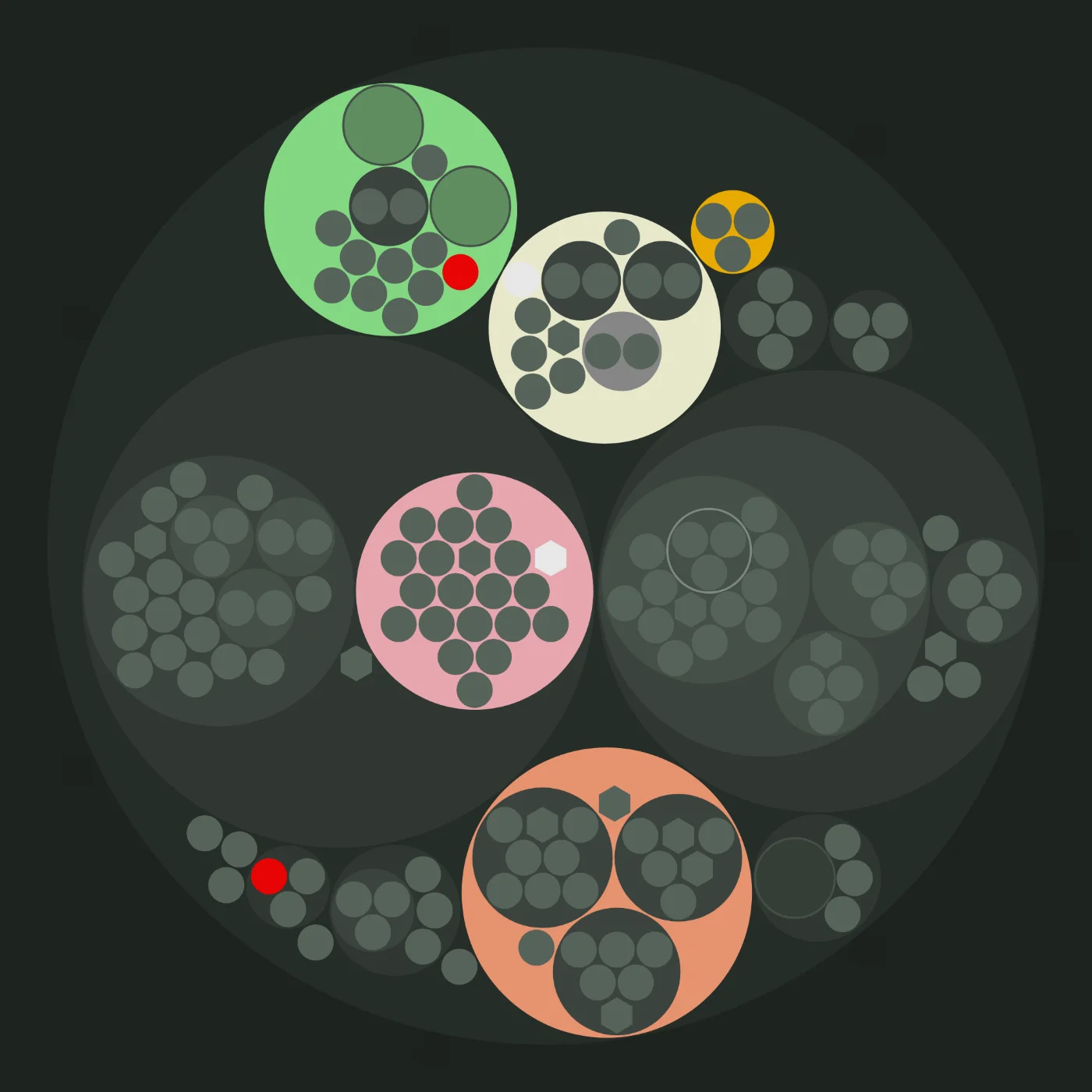
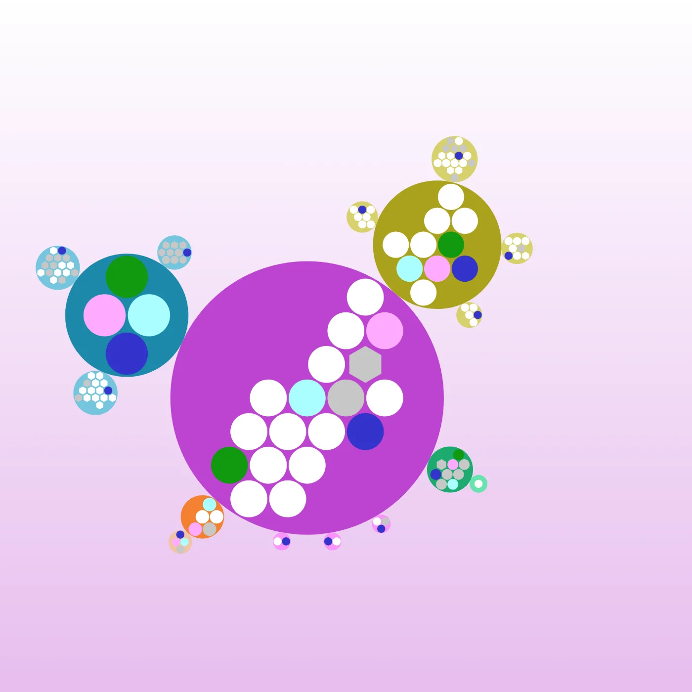
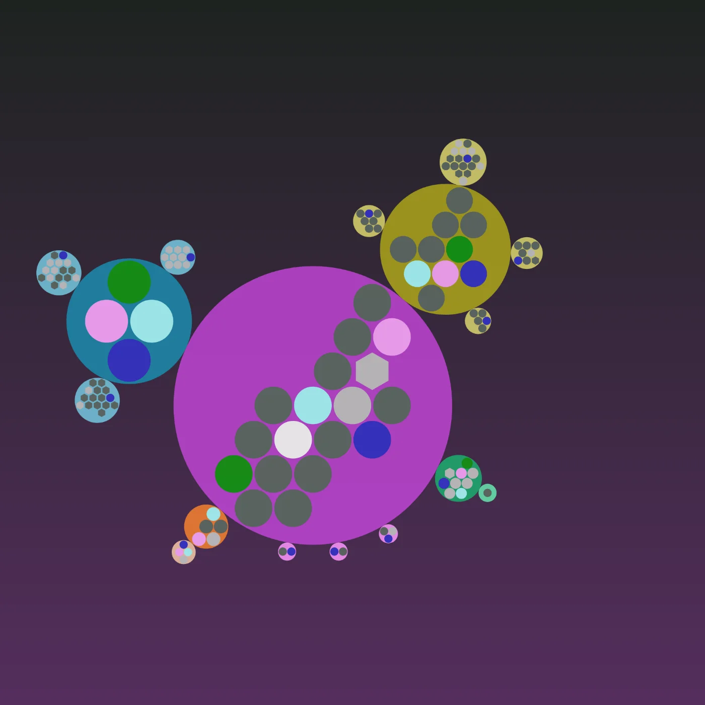
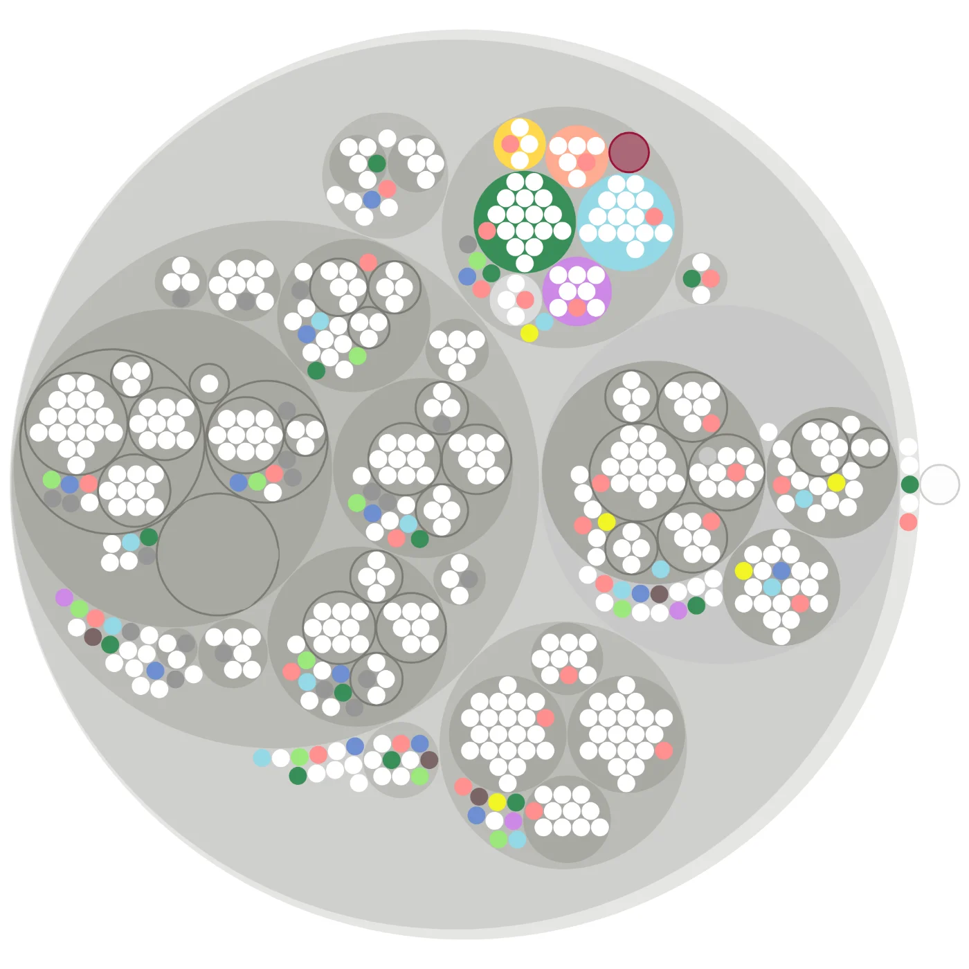
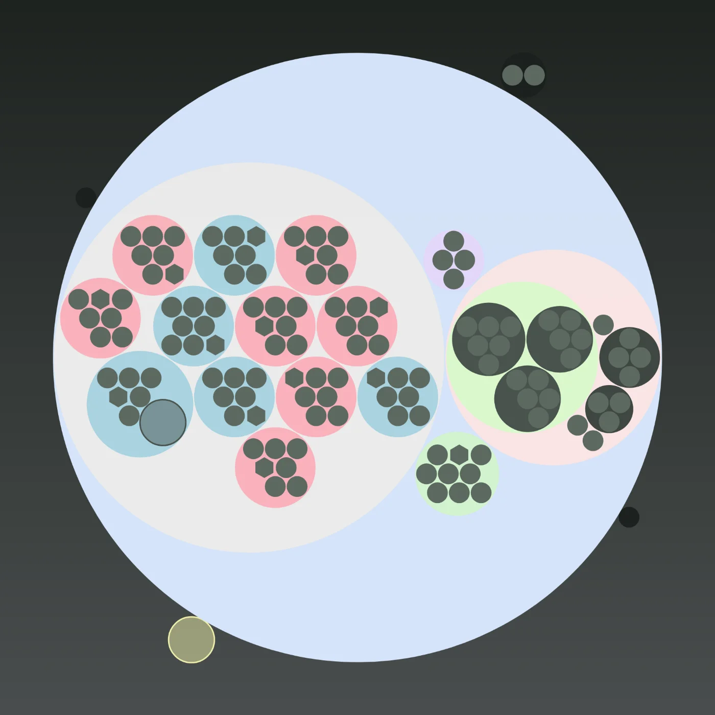
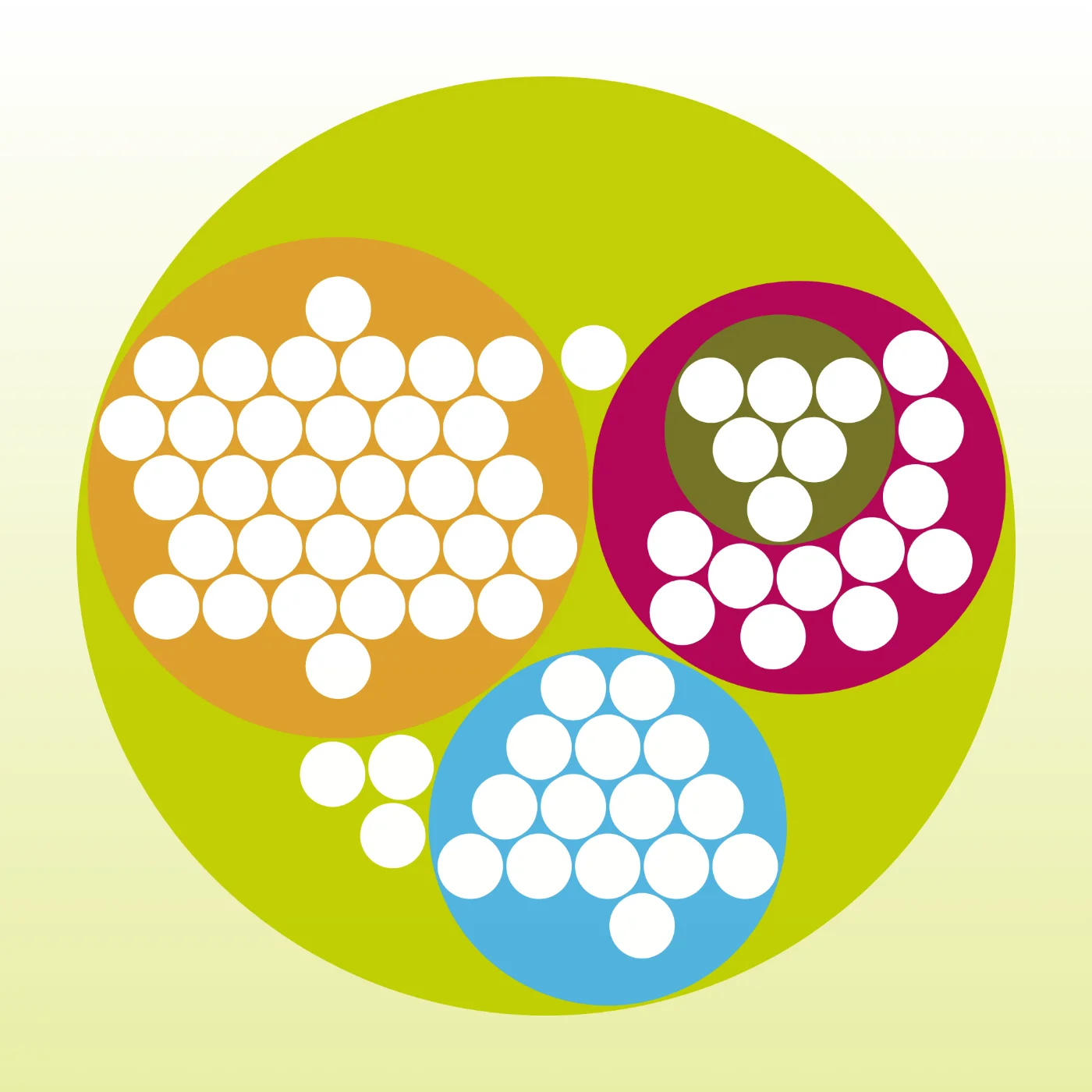
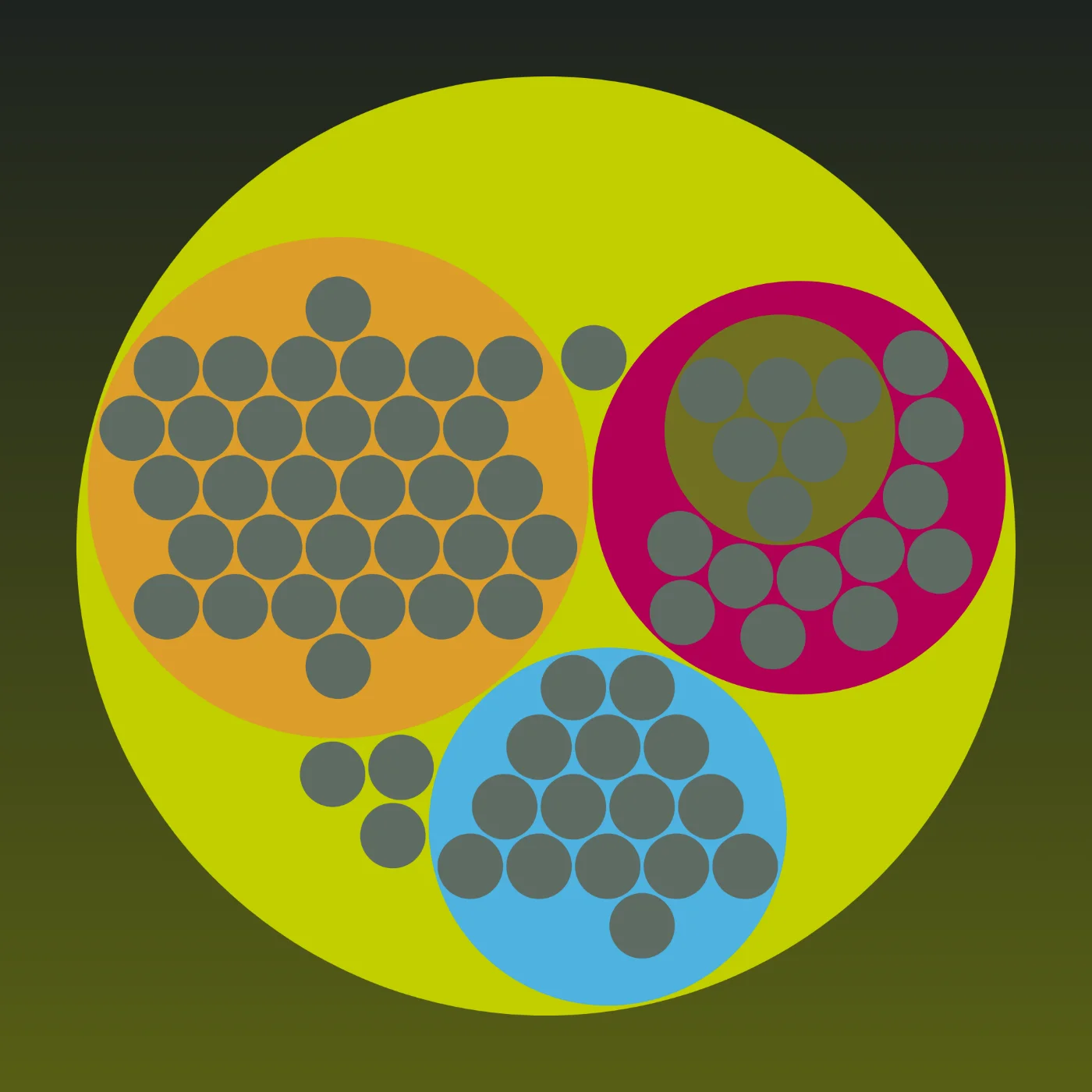
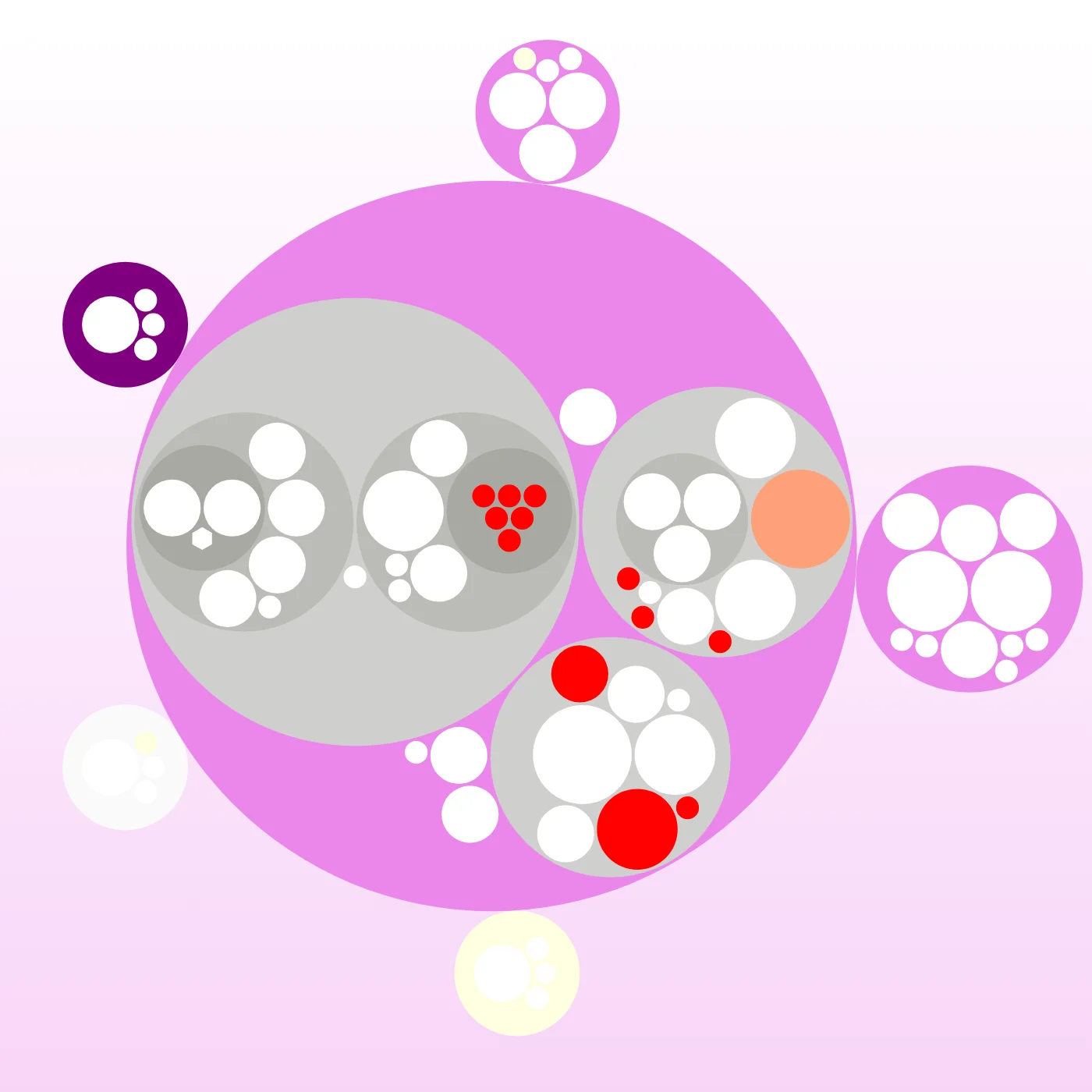
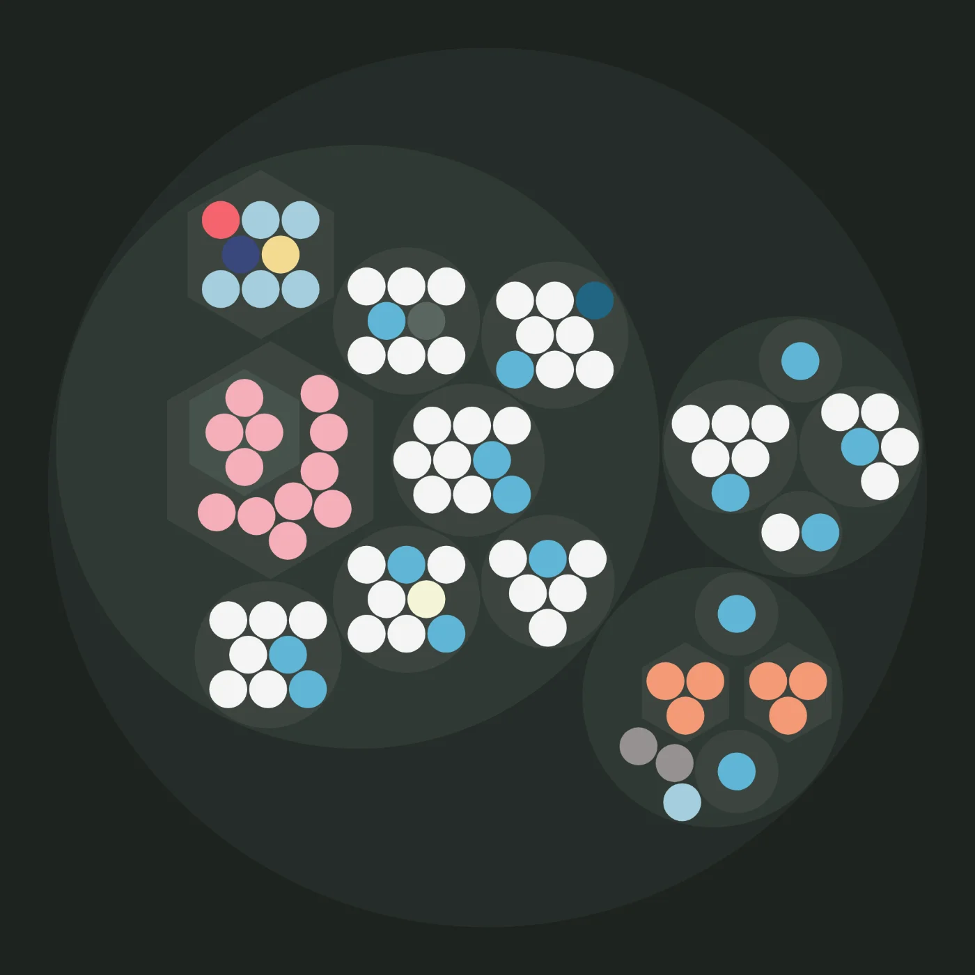
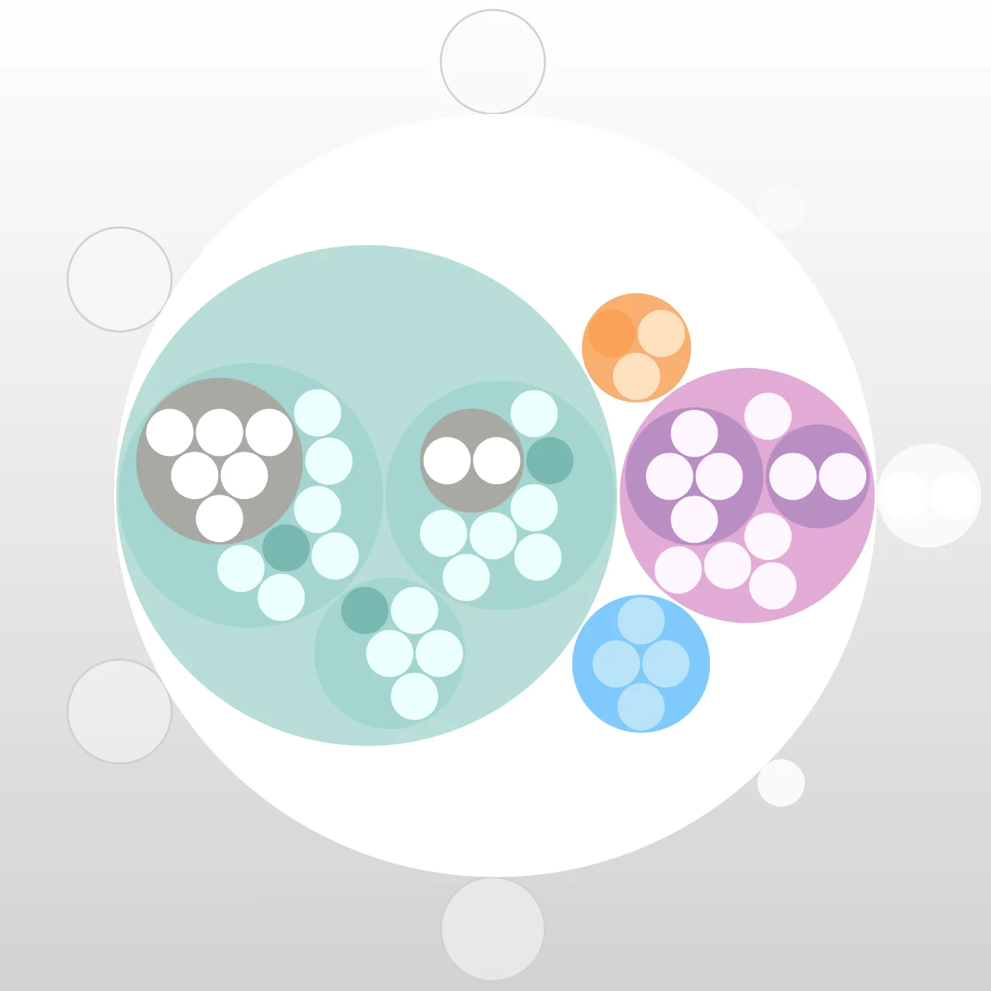
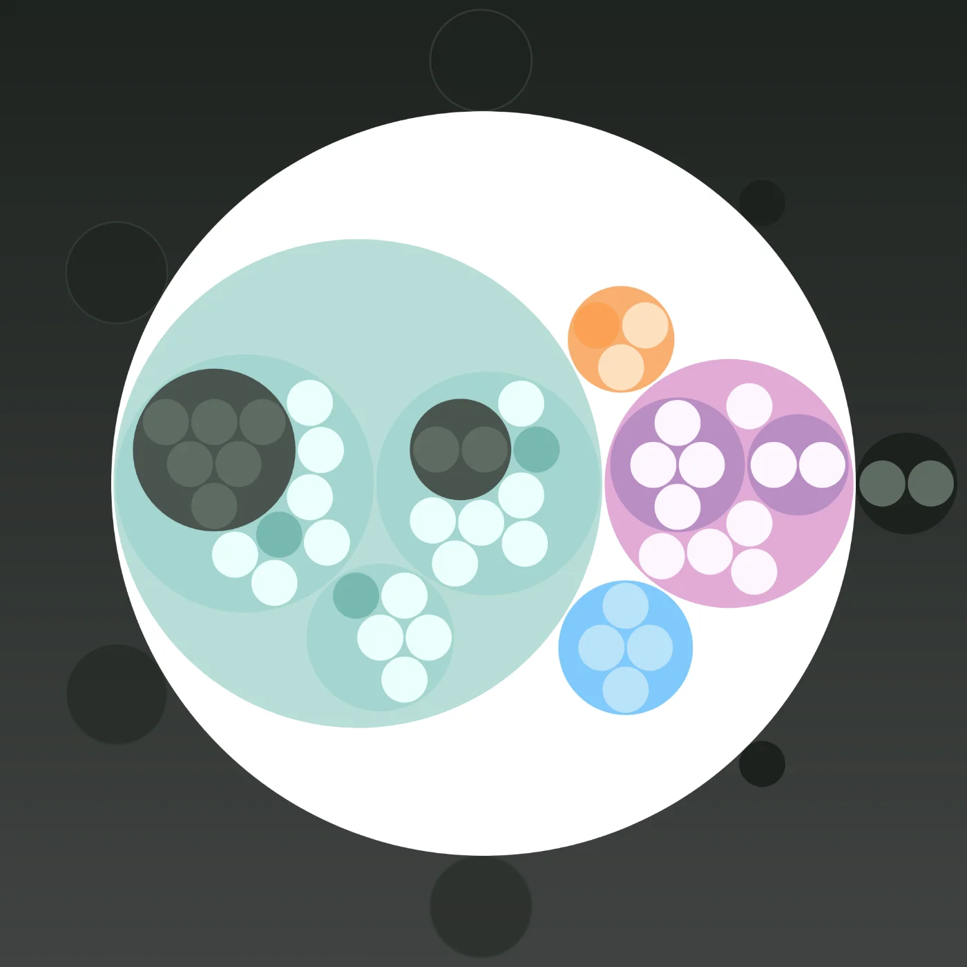
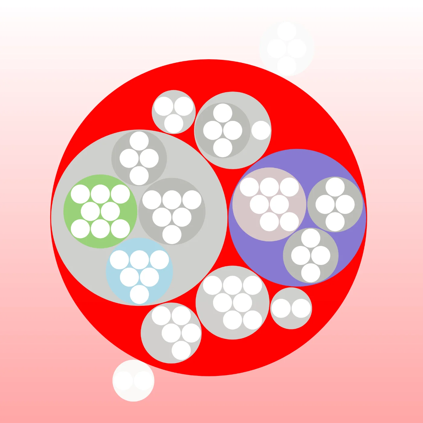
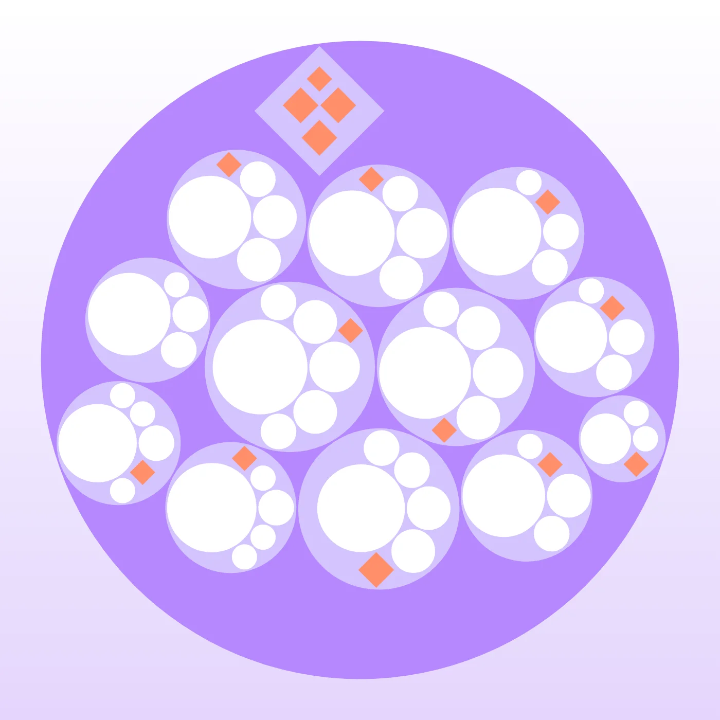
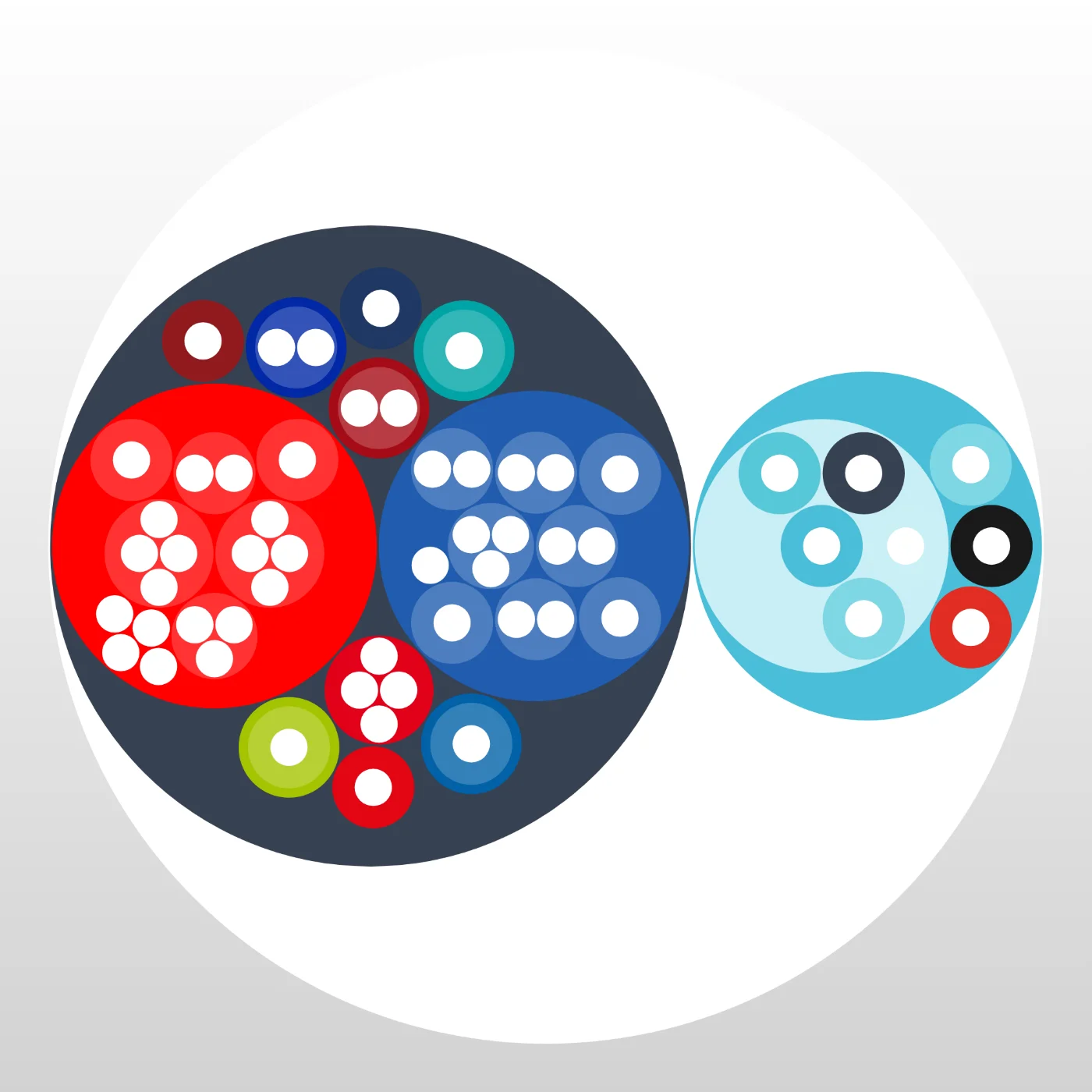
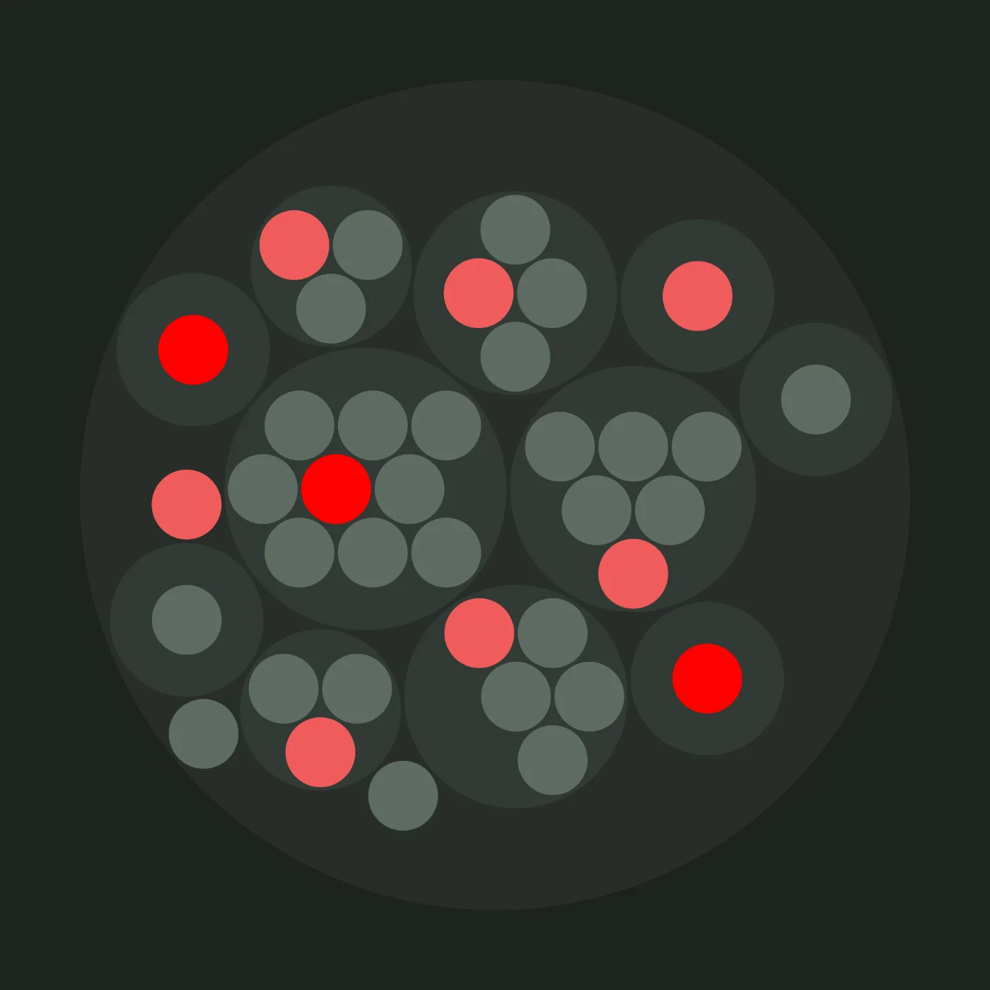
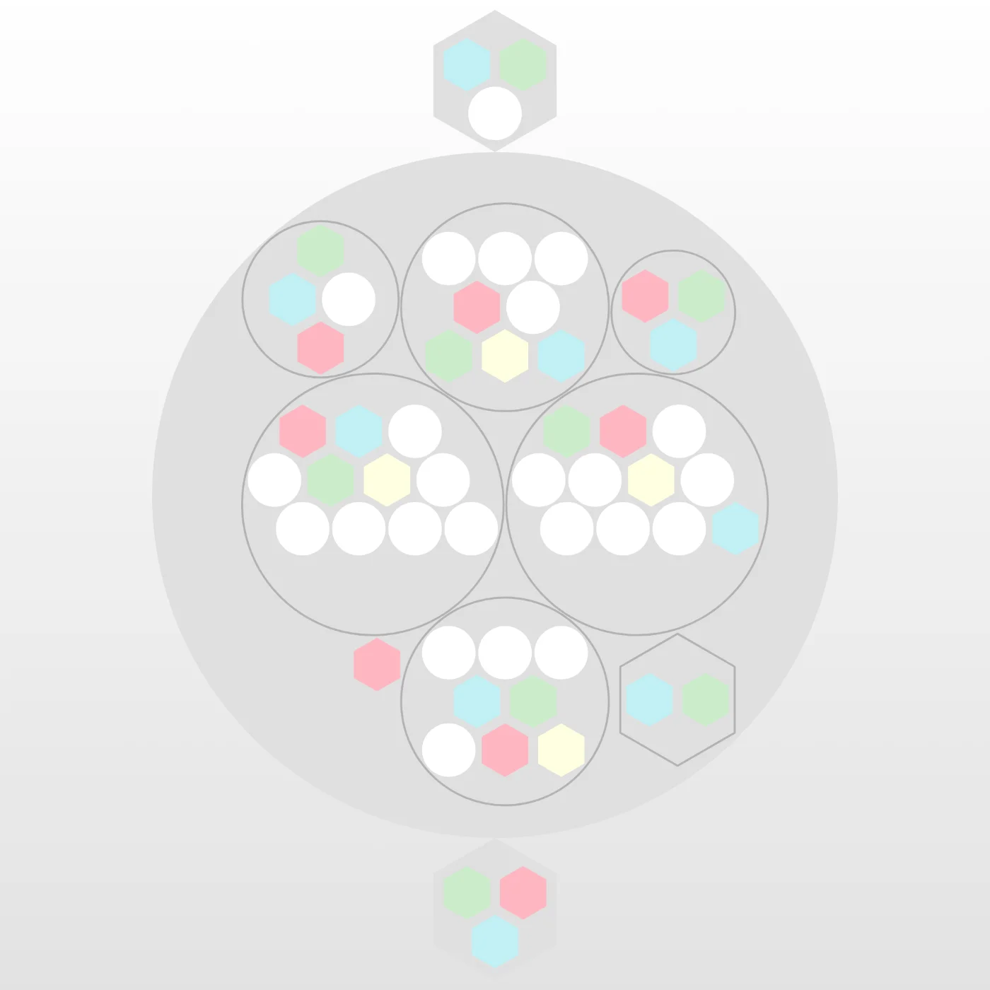
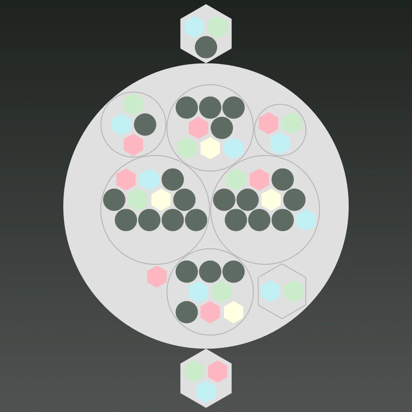
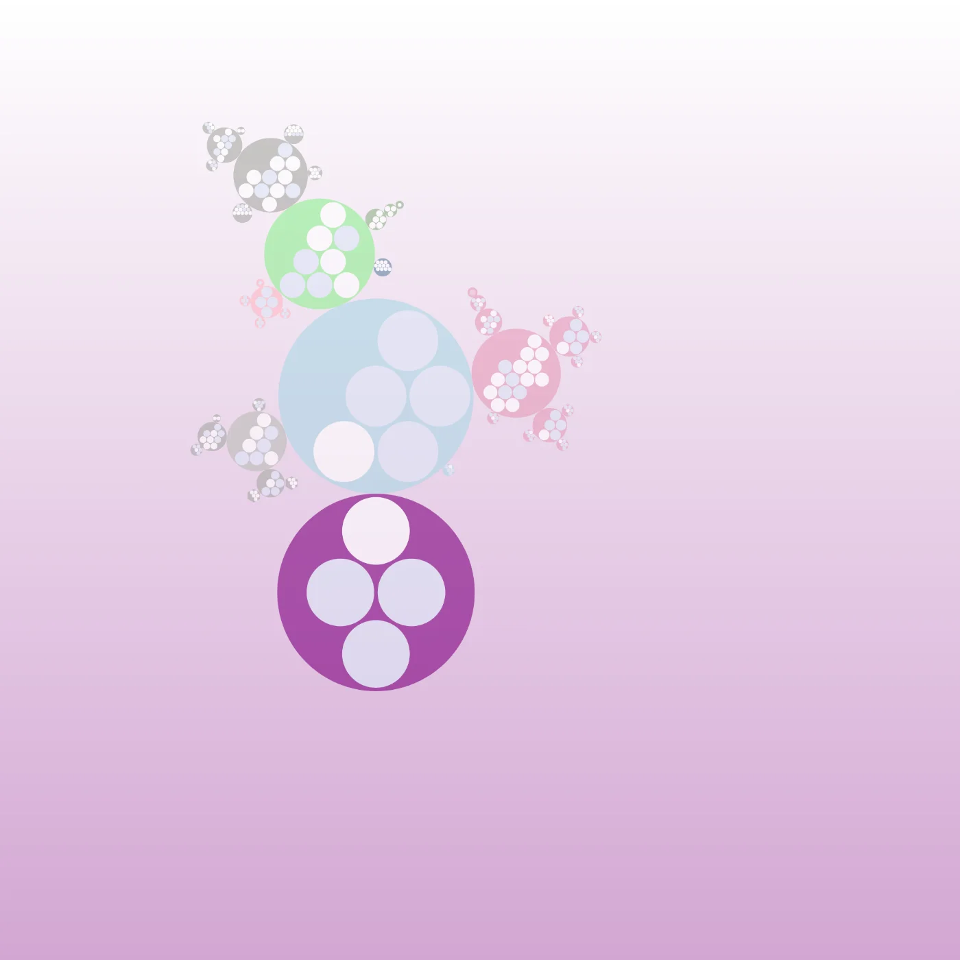
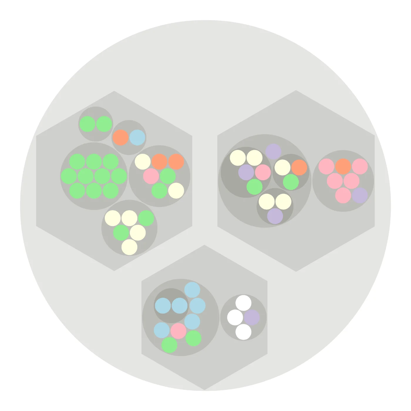
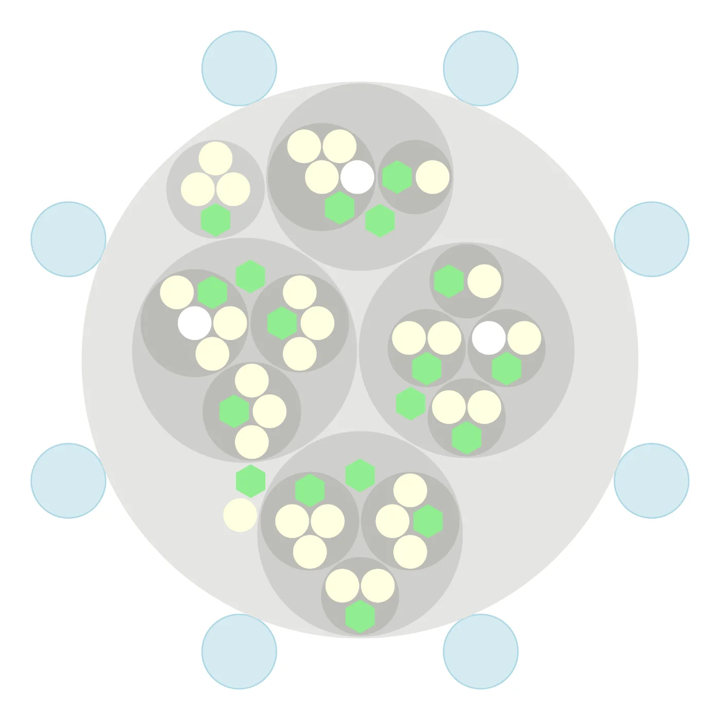
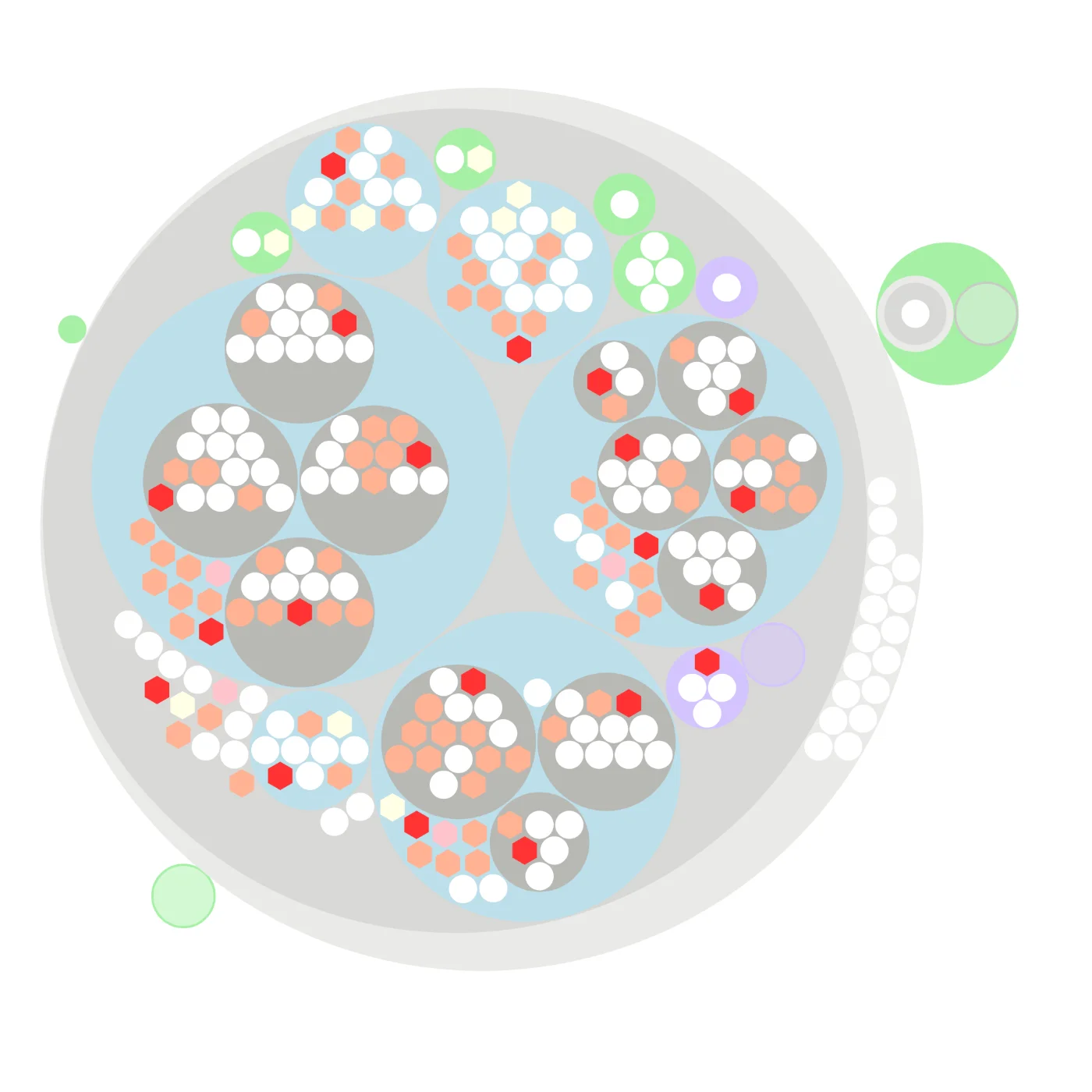
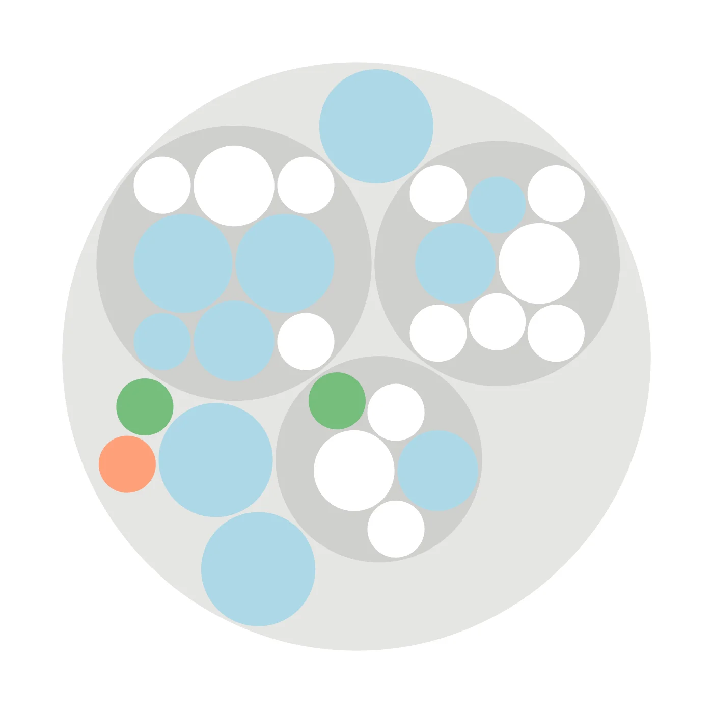
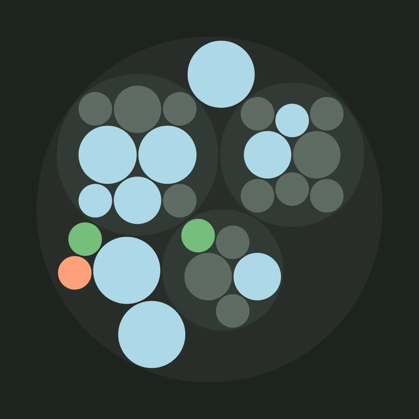
Yes: Peerdom’s showcase features more than 50 live organizational maps from real companies, NGOs, cooperatives, and startups. Each map is interactive: you can explore teams, roles, and people in real time. Unlike static org chart templates, these are actual organizations using Peerdom daily to visualize their structure.
Is Peerdom a free org chart tool?
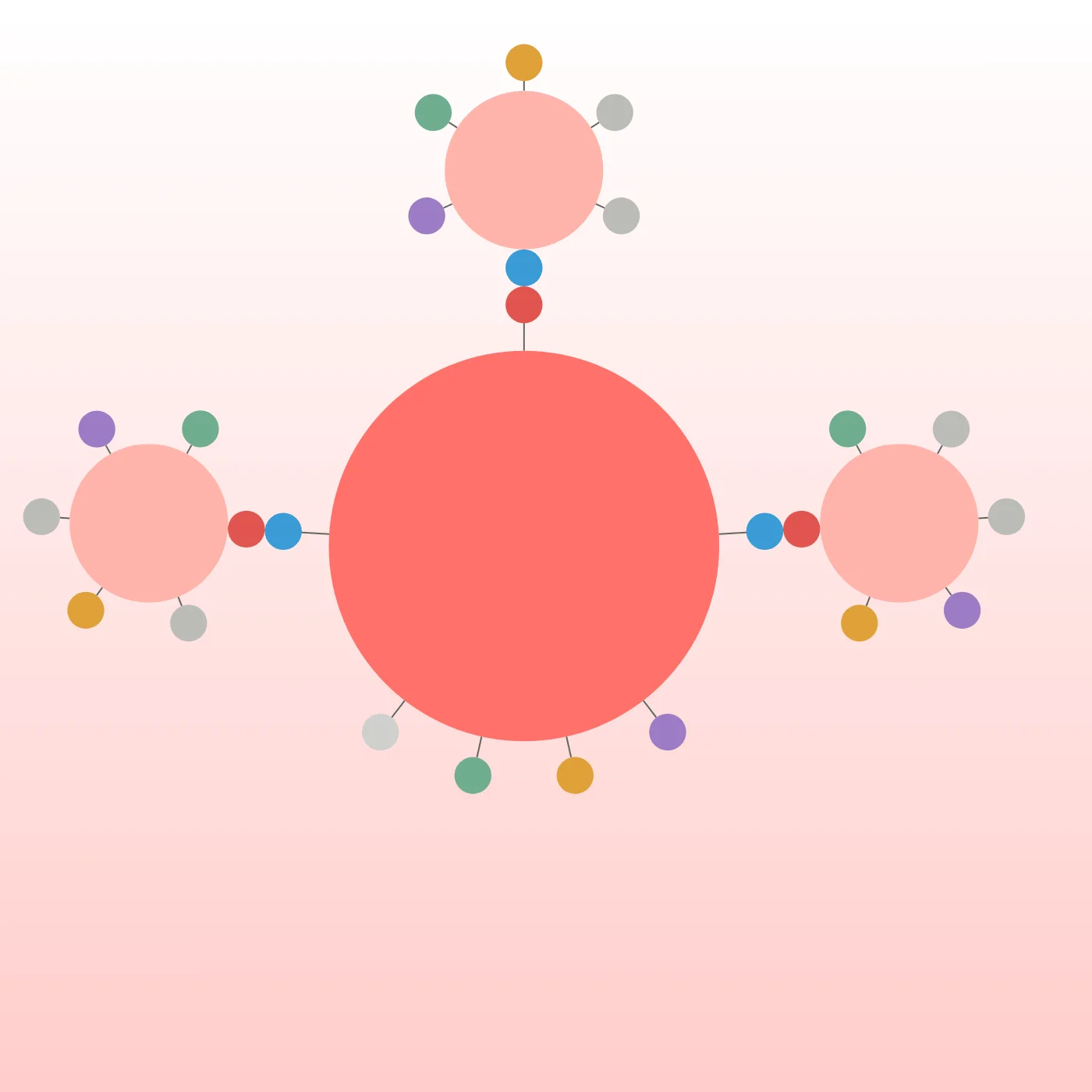
Peerdom offers a free plan for up to 10 accounts with all core features included: interactive maps, multiple views (circle, tree, pyramid, radial, 3D), and powerful search. You can create your organizational map at no cost and make it public so others can explore it too.
How do I make my organization's map public?
Any Peerdom organization can enable public access from the map settings. Once published, your map gets a shareable link at peerdom.org/your-slug that anyone can explore: no login required. Public maps also become eligible for the showcase directory, giving your organization additional visibility.
Do organizations that use Peerdom make good places to work?
Some hold Great Place To Work® certification, based on employee feedback about their workplace. Others are B Corps, whose certification assesses broader social and environmental impact, including how workers are treated. Loyco, for example, has been a B Corp since 2015.
Peerdom doesn’t earn those labels for anyone. It supports what they measure: clear responsibilities, open information, and people who know where they belong and who to ask.
What types of organizations use Peerdom?
The showcase includes companies, tech start-ups, NGOs, cooperatives, municipalities and schools. Their maps range from classic hierarchies with departments and positions to networked, team-based structures. The common thread is a commitment to organizational transparency.
How are these maps different from static org chart templates?
Static org chart templates are snapshots that go stale the moment someone changes roles. Peerdom maps are live and interactive: they update in real time as the organization evolves. You can zoom into teams, search across the entire structure, switch between multiple views (circle, tree, pyramid, 3D), and see real people in real roles. It’s the difference between a paper map and Google Maps.