Meet the Bubble Map: an org chart that grows like your organization
Bastiaan Van Rooden
Organizations change shape all the time. The Bubble Map draws every team as a cell that grows, splits and reshapes as your structure changes. It is available today on every plan.
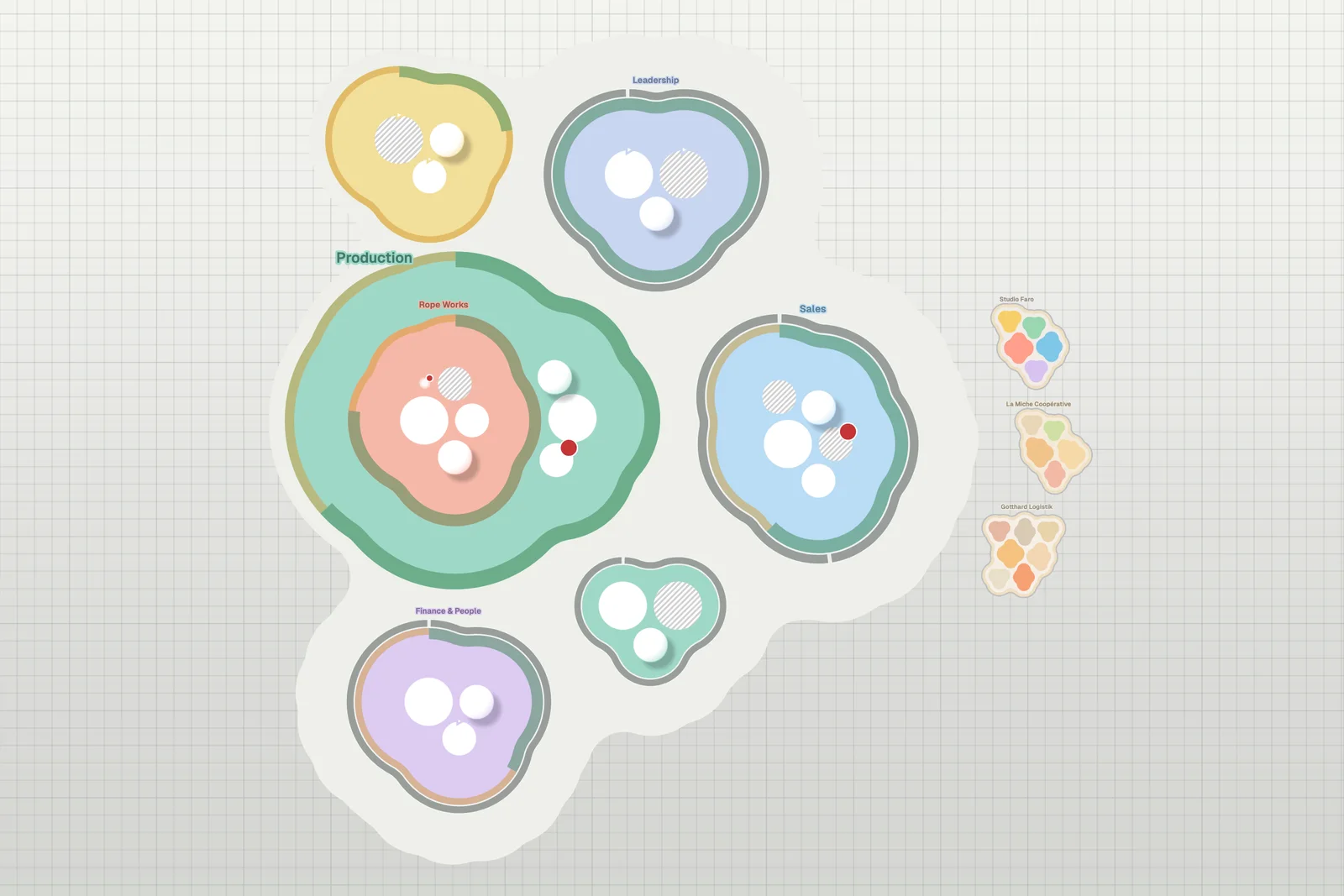
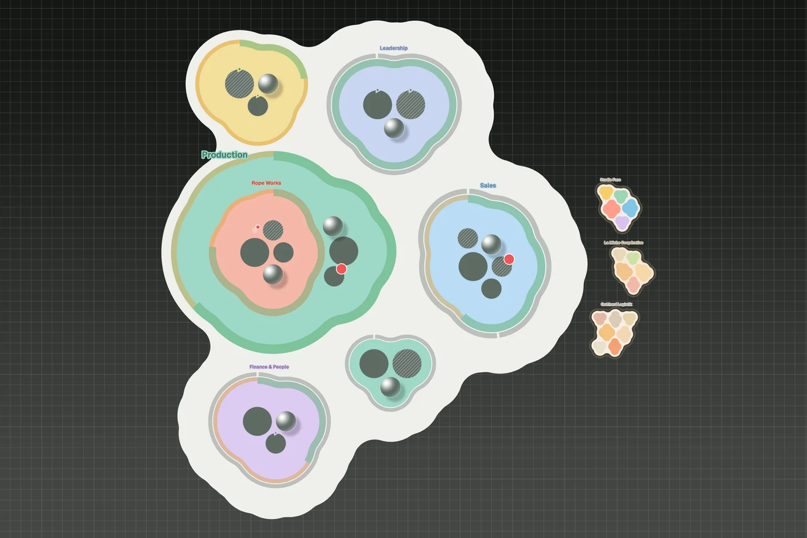
Every org chart you have ever seen is a picture of a moment. Boxes, lines, a neat pyramid. It was true on the day someone drew it, and it started going out of date the next morning.
Organizations don’t hold still. A team splits because it has grown too large to talk to itself. Two groups that kept bumping into each other merge. A role appears on Monday because a customer needed it, and by Friday it has a second person in it. None of this waits for a reorganization slide. It happens continuously, in small moves, the way living things grow.
The chart freezes. The organization moves. We think that gap is the most important thing an org chart gets wrong.
Organizations are alive
We see organizations as living systems more than machines. Teams form around a purpose, take on work, grow, split when they get too big and close when their work is done. We wanted a map that shows that.
Meet the Bubble Map
The Bubble Map is a new layout for the Peerdom map. Here is what it shows:
- Every team is one flowing outline. A group is no longer a fixed circle or box. Its outline wraps snugly around the roles and sub-teams inside it, like a membrane around a cell.
- Teams nest as cells within cells. A sub-team sits inside its parent as a cell of its own, and the parent’s outline flows around it.
- The shape comes from your structure, not from a template. Add three roles and the team grows. Split a group in two and the map shows two cells where there was one. Nobody draws the shape: Peerdom computes it from how you are organized, every time something changes.
- Goals and projects run along the edge. Goals sit on the inside of a team’s outline, showing how far the team has come on them, and projects run along the outside. You see what a team is working towards without opening a single panel.
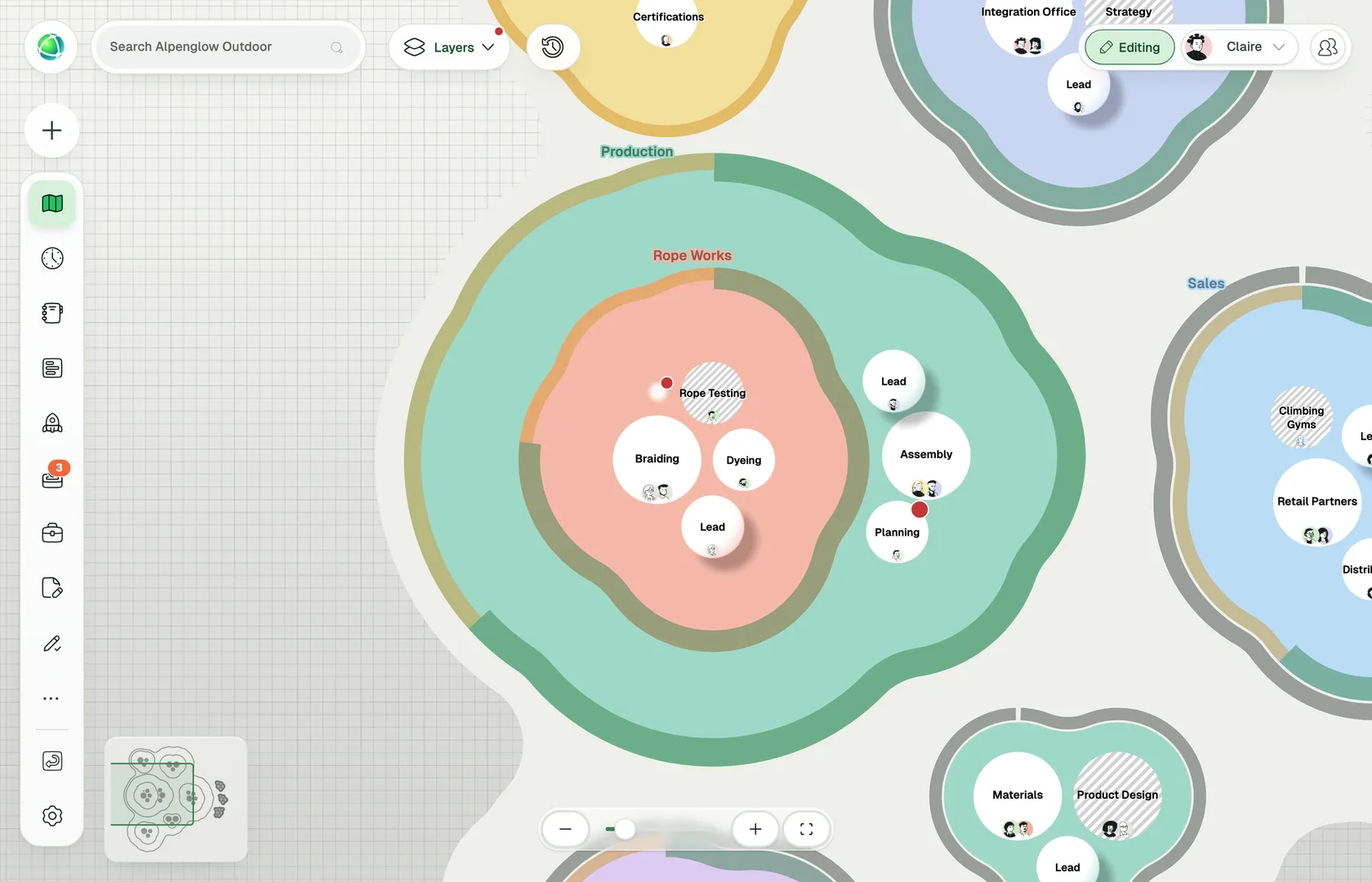
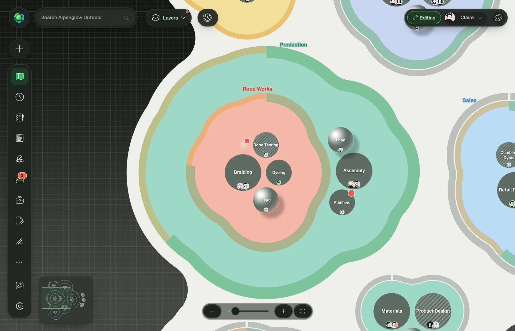
Everything you rely on in Peerdom stays the same. People still appear on the roles they hold, colors still mean what you set them to mean, and clicking a team or role opens it exactly as before. The Bubble Map changes how your organization looks, never what it is.
Every organization finds its own shape
Boxes and lines assume a hierarchy, and nested circles give every team the same shape. The Bubble Map still shows which groups sit inside which, and lets each shape follow what is inside it. A deep hierarchy, a holacracy, a sociocracy, a team of teams or a flat network of self-managing groups each looks like itself: a large team looks large, a team with one role looks small, and a group that has gathered sub-teams shows them.
Change, made visible
When your organization changes, the map changes with it. The people inside it don’t need a slide to understand what changed. They can see it, the way you can see that a cell has divided.
Available today, on every plan
The Bubble Map is available right now for every organization on Peerdom, on every plan.
An Owner of your Peerdom organization can switch it on in a few clicks: open Settings → Map, choose Change… under Layout, and pick Bubble. Preview shows it on your own screen first; Set layout switches the map for everyone in your organization. You can go back to any other layout at any time, and nothing about your structure changes along the way. The Bubble Map documentation walks through it step by step.
Keep reading
insights
AI agents already do real, ongoing work in companies: flagging defects, watching for regulatory changes, keeping records straight. The hard part is no longer building them. It is knowing what they own.
customer stories
The Swiss Army Logistics Center Grolley (CLA-G) used its org map to simulate jobs before hiring for them, within a transformation of 700 people
insights
Most of the stress around an audit comes from scrambling to prove who owns what. When every role and its responsibilities are written down and kept current, the answer is already sitting there.