


Your organization chart , generated in minutes
Answer six short questions about your context. Peerdom builds a complete organization map of teams, roles and responsibilities, inspired by how organizations like yours are structured. Then you edit it, instead of drawing it.
 Book a demo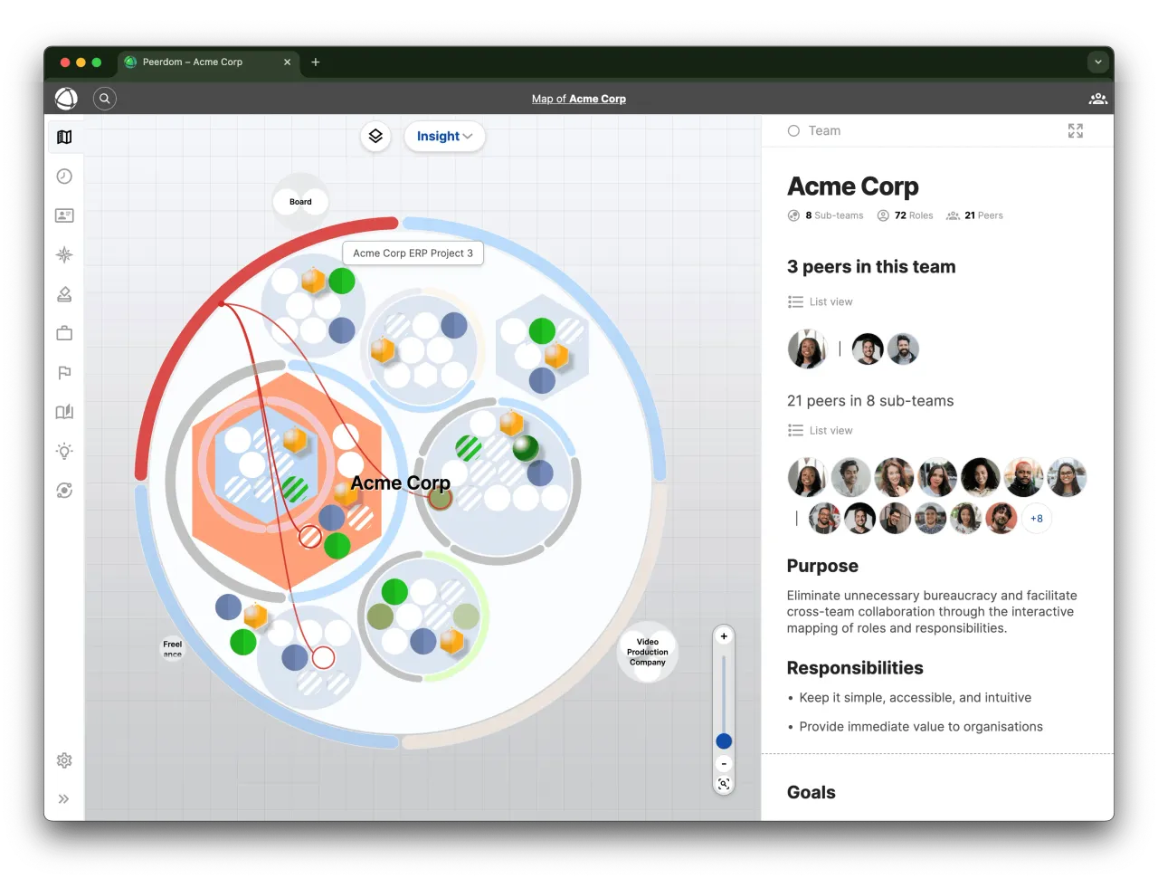





How the org chart generator works
in 3 simple steps
Describe your context
Six dropdowns: industry, operating model, stage, culture, size and ownership.
Get your map
A complete map of teams, roles and responsibilities appears.
Make it yours
Rename, restructure, invite your people. A working map, not a picture.
Why start from a generated map
Ready in minutes
No blank canvas, no boxes to drag. You start from a structure that already resembles your organization and correct it from there.

Roles, not just boxes
Every team comes with roles, and every role with responsibilities. Your chart says what people actually do, not only who reports to whom.

Privacy first
The model runs on Peerdom’s own infrastructure. Nothing you enter is sent to an external AI provider or used to train someone else’s model.

Yours to reshape
The generated map is a draft proposal. Keep what fits and rewrite the rest to fit your context.

Work as you wish
Chart your organization as a classical hierarchy, a network, a matrix, or cross-functional teams. 9 visualization types are available.

It stays current
Because everyone can see and update their own roles, the map keeps up with reality instead of ageing in a slide deck.
Org chart generator questions
How the generator works, what it asks, and where your data goes
Yes. Peerdom runs a privately hosted language model on its own infrastructure to turn your answers into a starting structure, informed by patterns across the many organizations already mapped in Peerdom.
We deliberately avoid calling it “AI-generated” in the product, because the result is not meant to be an answer you accept. It is a prototype you shape. You get a structure that already resembles organizations like yours, so you spend your time correcting and deciding rather than staring at an empty canvas.
Six questions, all of them dropdowns:
- Industry: the sector you operate in
- Operating model: how you work today, for example a functional hierarchy
- Stage: startup, scale-up or established organization
- Culture: from structured and hierarchical through to fully self-managed
- Size: the number of people in your organization
- Ownership: founder-owned, member-owned, investor-backed and so on
You can also pick a primary brand color so the map looks like yours from the start. There is nothing to upload and no employee list to prepare.
No. The model is hosted by Peerdom on Peerdom’s own servers. Your answers and the map that comes out of them are never passed to a third-party AI service, and they are never used to train an external model.
This matters if you work under data-sovereignty requirements: your organizational data stays inside the same Swiss-hosted environment as the rest of your Peerdom account. See where your data is stored for the full picture.
Yes. Generating a map is part of getting started with Peerdom, and the free plan covers up to 10 accounts with all core mapping features included. No credit card is needed to generate your first organization chart.
That is the point of it. What you get is a live organization map, not an exported image: rename teams, add or remove roles, rewrite responsibilities, restructure whole branches and invite people into them.
Most organizations keep the parts that describe them well, delete a handful of teams that do not apply, and reshape the rest over their first few sessions.
Yes, and the two work well together. Generate the structure first, then bring your people in: owners can import people in bulk via CSV from Settings → Import, or connect your employee directory so the map stays in sync as people join and leave.
Yes. Peerdom was built for organizations that do not fit a reporting tree, so the generator asks about your operating model and culture precisely to avoid handing a self-managed organization a pyramid.
Circles, networks, matrix structures and classic hierarchies are all supported, and the same map can be shown through 9 visualization types depending on who is looking at it.
Diagram tools generate a picture of your organization. Peerdom generates the organization itself: teams, roles and responsibilities as real objects that people can be assigned to, search through and update.
The practical difference shows up on the day something changes. A generated diagram has to be redrawn and re-shared; a Peerdom map is edited by the people concerned and is immediately current for everyone. Add-on apps for goals, projects and skills then build on that same structure instead of starting a new document.